The widespread use of red, amber, green approaches to data analysis is everywhere. The phrase ‘red, amber, green’ refers to graphical data displays that use colour coding of individual data values based on whether this value is on the right (green) or wrong (red) side of a target value. Often amber or yellow is used to indicate data values that are somewhere between ‘right’ and ‘wrong’.

Figure 1 shows the monthly count of a certain type of unwanted incident in mental healthcare. The horizontal line represents the target value of 10.5. That is, we do not want more than 10 incidents per month. Red bars show months above target. Green bars show months below target.
The data display in figure 1 is formally correct (green is better than red). However, it fails to convey a very important message while at the same time suggesting a false message. Figure 1 does not tell to what degree chance may be responsible for the observed variation between monthly counts. On the contrary, it suggests that different, assignable causes are producing red and green results. This often leads to actions being taken on red results, while green results are left alone or even celebrated. In its worst form, red, amber, green is used not even in conjunction with a time series but simply showing the last data point (week, month or quarter). However, if red and green results are all products of the same random process, this strategy is pointless.

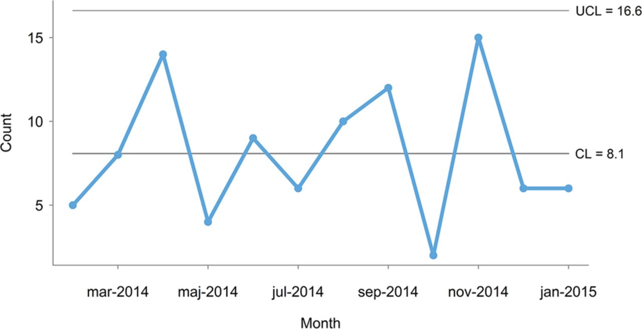
This is best illustrated using a control chart, with control limits that represent the limits of the random variation in data (figure 2).
The control chart in figure 2 shows that the monthly number of incidents is consistent with common cause variation because all data points are between the control lines (the lower control line is negative and not shown). That is, there is no reason to believe that the 3 months that are above target represent special causes — they are just as typical of the current process as the rest of the months on the chart. It follows that an improvement strategy should target the process as a whole investigating the common causes that affect all the incidents rather than look for special causes.
Furthermore, taking separate action on months above target with no special cause may be harmful for at least two reasons. First, actions that are applied in an on-off manner based on common cause variation will in fact increase the variation. Second, this strategy will inevitably create confusion and frustration within the organisation because it will not work and because the staff is repeatedly asked to change procedures and working habits without results getting any better.
Improvement Strategies
The distinction between common and special cause variation is crucial because the two types of variation require different improvement strategies.
Common Cause Variation
- satisfactory performance:
The process of interest is stable and is functioning at a satisfactory level wait-and-see strategy, - performance not satisfactory:
The process of interest is stable but it is not functioning at a satisfactory level improvement strategy always addresses the stabilised process as a whole rather than individual data points.
Special Cause VariationSpecial Cause Variation
- Special causes should be investigated and their root causes identified in order to stabilise the process
- Sometimes special cause variation may actually represent ongoing improvement (whether or not it was the result of some action). In those cases, a wait-and-see strategy may be justified. However, one should still seek to identify the root causes of the special cause variation in order to understand the drivers of improvement.
In general, special causes, if present, should be investigated first, and their root causes identified in order to stabilise the process BEFORE applying a common cause improvement strategy.
References
- Anhøj J, Hellesøe AMB. The problem with red, amber, green: the need to avoid distraction by random variation in organisational performance measures BMJ Qual Saf 2017;26:81-84.