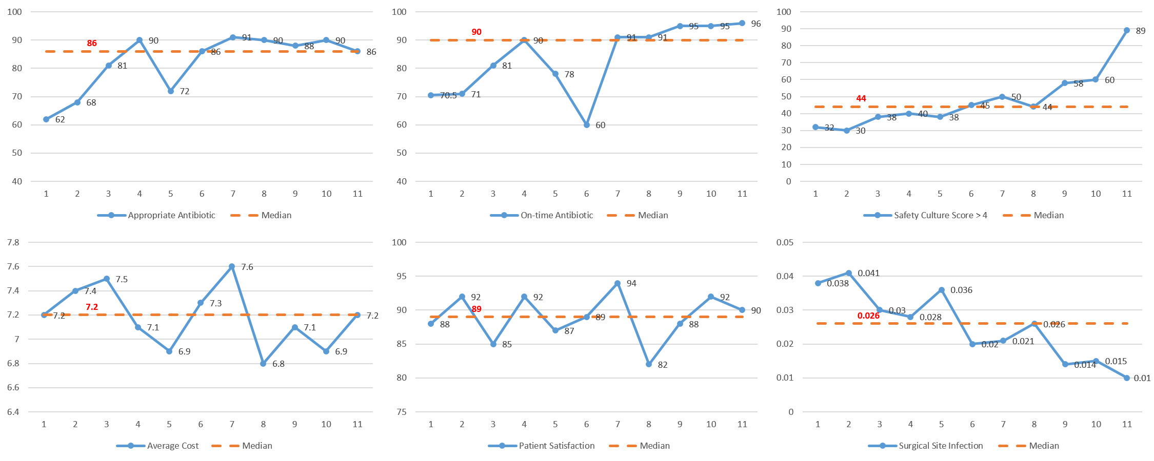
A run chart is a graphical display of data plotted in some type of order. It uses the median as the midline. It may also have a goal line. It is a visual tool that encourages users to ask good questions based on the data they are viewing.
① Simple Example
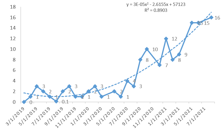
Run charts make variation visible. Although this project has documented recent improvement approaching the goal (95%), the chart should stimulate comments or questions about the April data point (68).
② Leading to Questions
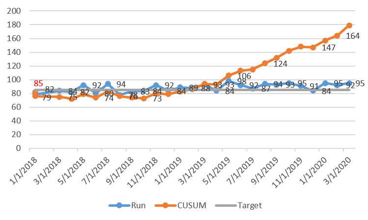
Run chart with goal line and tests of change annotated. Protocol version ① with no response and protocol version ② resulting in a shift (8 data points above midline) should have annotations on the chart at the appropriate point in the timeline.
③ Non-random Variation
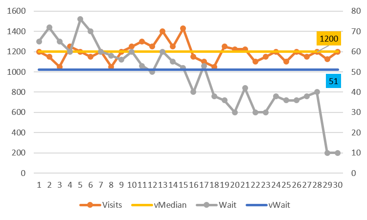
Studying a run chart can often reduce the risk of over-interpretation or tampering with the process. Does the chart show evidence of improvement that is obvious to all viewers? Use a set of rules to detect nonrandom change in the data.
④ No Evidence
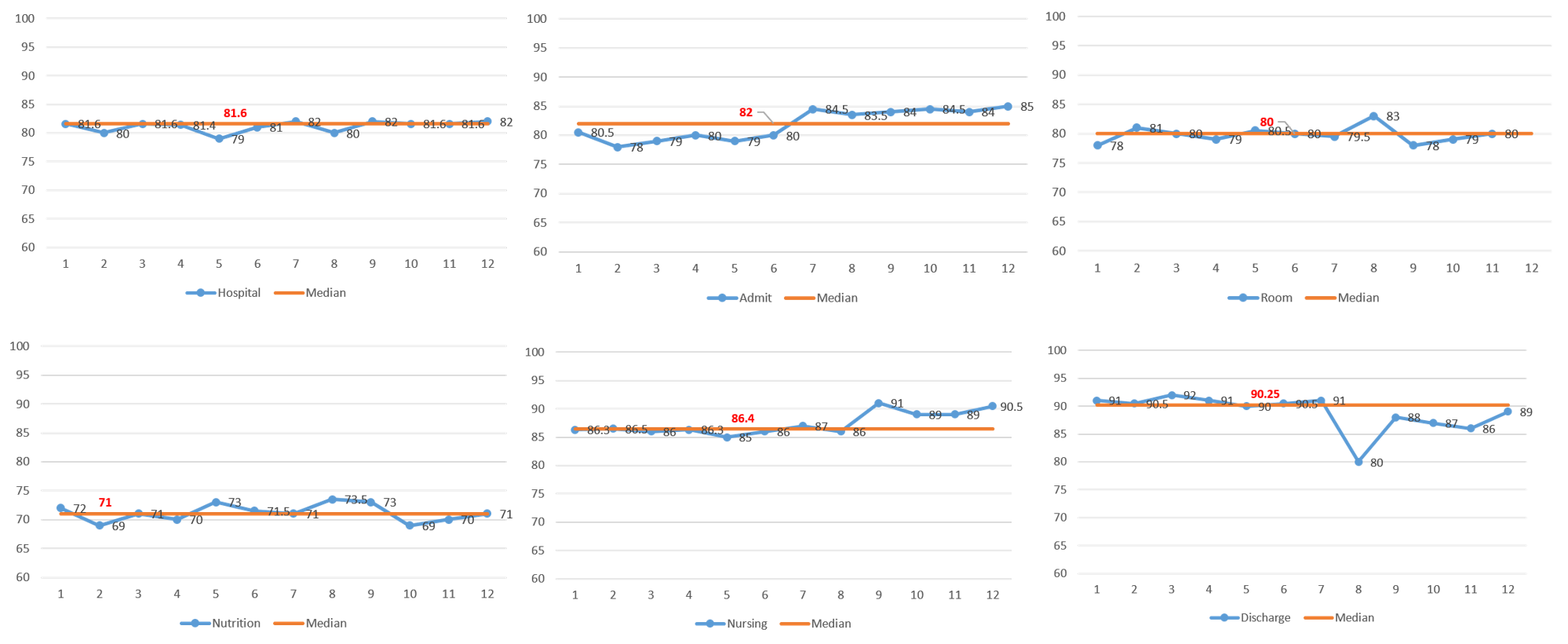
24 data points not on median. This chart has 23 crossing + 1 = 24 runs (expect 8 ~ 18 runs). This is too many runs and is a signal of non-randomness. This pattern most often represents the need for stratification. Too Many Runs
④ 11 data points (1 on median).
