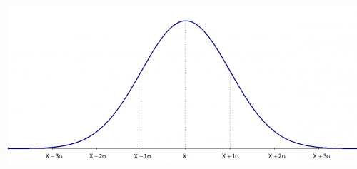
One of the most common assumptions for statistical analyses is that of normality, with nearly all parametric analyses requiring this assumption in one way or another. One of the first steps in assessing normality is to review a histogram of the variable. In this format, the X axis represents a variable's values, and the Y axis represents how many participants have each value. A normal distribution has most of the participants in the middle, with fewer on the upper and lower ends — this forms a central hump
with two tails (Figure 1).
If the data does not look like Figure 1, a possible way to fix this is to apply a transformation. Transforming data is a method of changing the distribution by applying a mathematical function to each data value. Draw a histogram with your data and if it looks like any of the pictures in Figure 2, you can apply the given transformation to each value and attempt to push the data closer to a normal distribution.
Links within this page
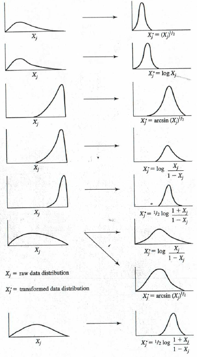
For example, if your data looks like the top example, take all of the values for that variable and apply a square root (i.e., raise the variable to the ½ power). This is easy to do in a spreadsheet program like Excel and in most statistical software such as SPSS. You can then check the histogram again to see how the (transformed) distribution of the new variable compares to a normal distribution. As long as the sample size exceeds 30 (even better if it is greater than 50), there is not usually too much of an impact on validity from non-normal data.
However, after transformation, the data may now approximate to normal, but interpreting that data may be much more difficult. For example, if you run a t-test to check for differences between two groups, and the data you are comparing has been transformed,you cannot simply say that there is a difference in the means of the two groups. Now, you have the added step of interpreting the fact that the difference is based on the square root. Often, to make your report meaningful for your designated audience, it is necessary to convert the calculated parameters (such as center-line, upper and lower control limits) back to the original units that were measured.
Strategies for transformation
Note: the capital letter `X` indicates a column vector in mathematics, that is, all values of `x_i`
-
If the probability plot is severely convex upward, indicating that the distribution of `X` is highly skewed to the right; for example, data from [gssi.csv] or [gssi.txt] used in Try Transform to Normal .
The original data are for `X^1` values. A lower power of `X` is suggested.

-
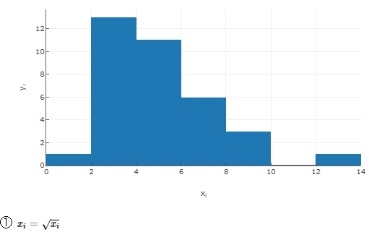
Try the square root of `X`, which is `X` to 1/2 power, or `X^0.5` or `X^½ `. The probability plot is still convex upward, only not as much.
-
Try `ln(X)`, the natural log. The probability plot shows less upward convexity.

-
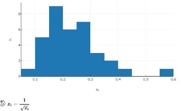
Try `X^-½ `. Taking 1 over the square root results in almost a straight line.
-
Try `X^(-1)` the reciprocal of `X`. The probability plot looks satisfactorily straight.

-
Try `X^(-2)` the reciprocal of `X^2`. The probability plot looks as though the straight-line fit is poorer.

`X^(-1)` will transform the original data into the needed near-normal data. The original surgery data, the `x_i` data, were expressed in terms of number of surgeries between each surgical site infection; `X^(-1)` is the reciprocal of `X`, so converts to number of surgical site infections per operation
.
For time between interval charts used in rare events (for example, inpatient falls): the `X` data is days per falls
, and the reciprocal is falls per day
.
Transformations are especially important when dealing with rare events: i-chart, t-chart, g-chart all are very sensitive to the underlying distribution; so it is better to transform to a near-normal distribution before performing other tests. Common examples:
- Weibull distribution `y^(1/3)` for g-charts (events between adverse event)
- 4th root `y^(1/4)` for hospital acquired infections.
Kurtosis [3] kurtos {Greek} arched
or bulging
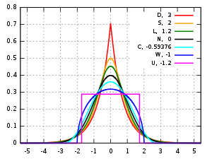
- Mesokurtic
- Kurtosis is typically measured with respect to the normal distribution. A distribution that has tails shaped in roughly the same way as the standard normal distribution, is said to be mesokurtic. The kurtosis of a mesokurtic distribution is neither high nor low, rather it is considered to be a baseline for the two other classifications.
- Leptokurtic lepto {Greek}
skinny
- A leptokurtic distribution is one that has kurtosis greater than a mesokurtic distribution. Leptokurtic distributions are sometimes identified by peaks that are thin and tall. The tails of these distributions, to both the right and the left, are thick and heavy. One of the most well known leptokurtic distributions is Student's t distribution.
- Platykurtic platy {Greek}
broad
- Platykurtic distributions are those that have slender tails. Many times they possess a peak lower than a mesokurtic distribution.
Distributions of data and probability distributions are not all the same shape. Some are asymmetric and skewed to the left or to the right. Other distributions are bimodal and have two peaks. Another feature to consider is the shape of the tails of the distribution on the far left and the far right. Kurtosis is the measure of the thickness or heaviness of the tails of a distribution. The kurtosis of a distribution is in one of three categories of classification:
Excess Kurtosis
These classifications of kurtosis are still somewhat subjective and qualitative. While we might be able to see that a distribution has thicker tails than a normal distribution, what if we don’t have the graph of a normal distribution to compare with? What if we want to say that one distribution is more leptokurtic than another? To answer these kinds of questions we need not just a qualitative description of kurtosis, but a quantitative measure. The formula used is μ4/σ4 where μ4 is Pearson’s fourth moment about the mean and sigma is the standard deviation.
Now that we have a way to calculate kurtosis, we can compare the values obtained rather than shapes. The normal distribution is found to have a kurtosis of three. This now becomes our basis for mesokurtic distributions. A distribution with kurtosis greater than three is leptokurtic and a distribution with kurtosis less than three is platykurtic. Since we treat a mesokurtic distribution as a baseline for our other distributions, we can subtract three from our standard calculation for kurtosis. The formula μ4/σ4 - 3 is the formula for excess kurtosis. We could then classify a distribution from its excess kurtosis:
- Mesokurtic distributions have excess kurtosis of zero.
- Platykurtic distributions have negative excess kurtosis.
- Leptokurtic distributions have positive excess kurtosis.
Skewness [4]
Some distributions of data, such as the bell curve or normal distribution, are symmetric. This means that the right and the left of the distribution are perfect mirror images of one another. Not every distribution of data is symmetric. Sets of data that are not symmetric are said to be asymmetric. The measure of how asymmetric a distribution can be is called skewness.
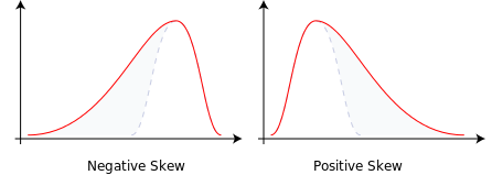
- Skewed to the Right
- Data that are skewed to the right have a long tail that extends to the right. An alternate way of talking about a data set skewed to the right is to say that it is positively skewed. For a data set skewed to the right:
• Always: mean greater than the mode
• Always: median greater than the mode
• Most of the time: mean greater than median - Skewed to the Left
- The situation reverses itself when we deal with data skewed to the left. Data that are skewed to the left have a long tail that extends to the left. An alternate way of talking about a data set skewed to the left is to say that it is negatively skewed. For data skewed to the left:
• Always: mean less than the mode
• Always: median less than the mode
• Most of the time: mean less than median
Measures of Skewness
It’s one thing to look at two sets of data and determine that one is symmetric while the other is asymmetric. It’s another to look at two sets of asymmetric data and say that one is more skewed than the other. It can be very subjective to determine which is more skewed by simply looking at the graph of the distribution. This is why there are ways to numerically calculate the measure of skewness.
One measure of skewness, called Pearson’s first coefficient of skewness, is to subtract the mean from the mode, and then divide this difference by the standard deviation of the data. The reason for dividing the difference is so that we have a dimensionless quantity. This explains why data skewed to the right has positive skewness. If the data set is skewed to the right, the mean is greater than the mode, and so subtracting the mode from the mean gives a positive number. A similar argument explains why data skewed to the left has negative skewness.
Pearson’s second coefficient of skewness is also used to measure the asymmetry of a data set. For this quantity, we subtract the mode from the median, multiply this number by three and then divide by the standard deviation.
Jarque-Bera Test [5]
The Jarque-Bera Test is a test for normality. Normality is one of the assumptions for many statistical tests, like the t test or F test; the Jarque-Bera test is usually run before one of these tests to confirm normality. It is usually used for large data sets. Specifically, the test matches the skewness and kurtosis of data to see if it matches a normal distribution.
A normal distribution has a skew of zero (i.e. it’s perfectly symmetrical around the mean) and a kurtosis of three.
The null hypothesis of the Jarque-Bera test is a joint hypothesis of the skewness being zero and the excess kurtosis being zero. With a p-value >0.05, one would usually say that the data are consistent with having skewness and excess kurtosis zero.
The formula for the Jarque-Bera test statistic (usually shortened to just JB test statistic) is:
where:
`n` : the number of observations in the sample
`S` : the sample skewness
`C` : the sample kurtosis, usually as
excess kurtosis=> (C-3)
Example: [11]
	Placed in Excel column B2:B16

	1, 1, 1, 2, 2, 2, 2, 2, 2, 2, 3, 3, 6, 7, 8
| Parameter | Result | Store | Excel formula |
|---|---|---|---|
| n | 15 | B18 | =COUNT($B$2:$B$16) |
| Skewness | 1.499564 | B19 | =SKEW($B$2:$B$16) |
| Kurtosis | 1.072465 | B20 | =KURT($B$2:$B$16) |
| JB Statistic | 7.943849 | B21 | =(B18/6)*(B19^2)+((B20-3)^2)/4) |
| p-value | 0.018837 | B22 | =CHISQ.DIST.RT(B21,2) |
Interpretation: In general, a large JB value indicates that errors are not normally distributed. A value of 0 indicates the data is normally distributed. The p-value can be calculated using an Excel function [10] with two degrees of freedom: the p-value (0.018837) for the raw data in this example is less than 0.05 and the large (>1.0) JB value (7.943849) from this test means that you can reject the null hypothesis that the data is normally distributed.
Calculations [8]
Calculations for skewness and kurtosis use the following equations:
The skewness is `beta_3` and the kurtosis is `beta_4`. (Sometimes the kurtosis
refers to excess kurtosis
which is `beta_4-3`)
| Graph | Skewness | Kurtosis | JB Statistic | p-value | >0.05 |
|---|---|---|---|---|---|
| Data | -0.000 | 1.798 | 2.107 | 0.349 | Y2 |
| ① | 1.395 | 5.502 | 20.480 | tiny | - |
| ② | 0.809 | 3.816 | 4.788 | 0.091 | Y4 |
| ③ | 0.738 | 3.669 | 3.827 | 0.147 | Y3 |
| ④ | 0.108 | 2.985 | 0.068 | 0.966 | Y1 |
| ⑤ | 1.199 | 5.048 | 14.500 | 0.0007 | - |
| ⑥ | 2.592 | 11.099 | 134.839 | tiny | - |
| ⑦ | 4.528 | 23.933 | 758.596 | tiny | - |
| ⑧ | 2.796 | 13.013 | 191.817 | tiny | - |
Interpretation: using p-value > 0.05 as decision point (5%), the right-hand column shows that four rows (raw data, and three transformations) exceeded this threshold (the superscript indicates strength of that transformation in achieving a normal distribution; that is, Y1 > Y2 > Y3 > Y4).
The same result would be achieved by only using the JB-test scores (those closest to zero); however, only one of these results is less than one (close to zero). Since a normal distribution has a JB-test of zero, Y1 `ln(x_i)` seems to be the best transformation for this set of data.
References
- Hart MK, Hart RF. Statistical process control for health care. 2000 www.amazon.com
- Transforming Data for Normality www.statisticssolutions.com
- Taylor C. How to classify the kurtosis of distributions 2020-08-28 www.thoughtco.com
- Taylor C. What is skewness in statistics? 2020-08-25 www.thoughtco.com
- Kurtosis en.wikipedia.org
- Skewness en.wikipedia.org
- McNeese B. Normal probability plots www.spcforexcel.com
- whuber (Moderator) How to efficiently calculate Kurtosis and Skewness of data having value with repetitions? stats.stackexchange.com
-
Glen S.
Jarque-Bera Test
From StatisticsHowTo.com: Elementary Statistics for the rest of us! www.statisticshowto.com - CHISQ.DIST.RT Function: Calculates the right-tailed probability of a chi-square distribution corporatefinanceinstitute.com
- Bobbitt Z. How to Transform Data in Excel (Log, Square Root, Cube Root) www.statology.org