If rate > 0.10 (number-between < 10), use standard percent type of measures • 3 SSI's in 20 patients = 0.15
If rate < 0.10 (number-between > 100), use number-between type of measures • 1 complication in 200 days = 0.005 • 1 needle stick in 100 days = 0.01
If 0.01 < rate < 0.10, use either/both measures
If a rare event is roughly defined as something that occurs with a frequency of less than 10%, then there are many examples in healthcare including medication errors, patient falls, nosocomial infections, surgical complications and VAP. If non-rare event, rate-based, control charts are used to monitor these adverse events, they have the following problems:
The majority of points is equal to zero
It is not clear, just by looking, what it means (is it acceptable or not)?
Statistically not useful
Two types of situations can occur:
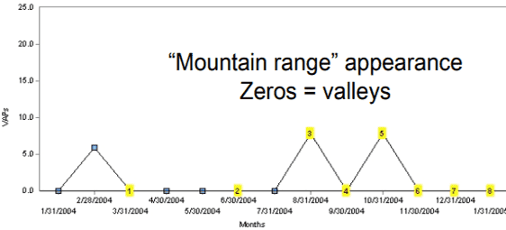
Periodic rare events: mountain range appearance where the zeros are the valleys (Figure 1a)
Prolonged periods with no events (Figure 1b).
Figure 1a: Peaks and valleys with no events for long periods of time[1]
Figure 1b: Prolonged periods with no events[1]
Which raises the question: How long before we can say with confidence that the process has shown significant improvement? [See Table 1 at the bottom of this page]
Practical Implementation
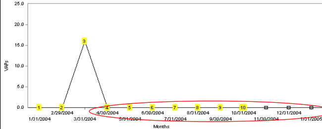
If no defect (SSI) by end of month, plot total number cases so far
Can still detect an improvement even before next SSI
Update point when eventually have a failure
Figure 2a. Days between VAP example[1]
Figure 2b. If no defect (SSI) by end of month[1]
Often compliance with a related process is used to indirectly assess a clinical outcome. Some examples:
Antibiotic timing for surgical prophylaxis, which is assumed to correlate with the SSI rate.
Compliance with WHO Surgical Safety Checklist, compared to perioperative adverse events (POAE).
Solutions are based on measuring the event interval:
Number of cases between events (g chart): for example, the number of surgical operations between surgical site infections
Number of open heart surgeries between sternal wound infections.
Number of CABG procedures between adverse events.
Time between (interval) events (t-chart): for example, number of inpatient days between patient falls. This is used because it is not always practical to measure the exact number between events. Some examples:
Days between needle sticks.
Number of inpatient days between patient falls.
This data is relatively easy to collect: you only need to record the dates that events occurred. However, evaluating the interval control needs a change in thinking.
Chart Interpretation — identifying process change
#1. A higher value on the chart means that the rate of the event occurring has actually decreased because the time between events is longer. For adverse events this is a good thing. Similarly, a smaller value plotted on the chart means that the rate of the event occurring has increased.
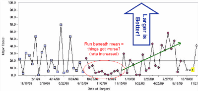
#2. Runs above or below baseline median
5 ~ 6 points = Probable improvement
5 ~ 6 points = Probable improvement
8 points or more = Near-certain improvement
Figure 3. Number of cases between surgical site infections (SSI)[1]
#3. Simple rule {3:X̄ rule}:
Compute baseline average time-between (can be overall, which is more conservative), or before changes.
Plot the time or number between events.
Check if the plotted value > 3 times the average? If so, improvement (reduction in rate) at approximately 0.05 significance level. Alternatively use 4 x baseline for approximately 0.02 significance.
Number of consecutive months with zero cases.
Plot the number of cases per month. Calculate the monthly baseline average.
Divide 3 by the monthly baseline average. Is the number of consecutive months with zero > 3 times the average? If so, improvement (reduction in rate) at approximately 0.05 significance level.
The lower the rate (rare event), the longer the period of consecutive zeros required to confirm improvement (Table 1). For example, if an event occurs each month (12/year), thens 3 consecutive months of zeros are required, whereas a rate of 1 event per year would need 3 years of zeros for confirmation.
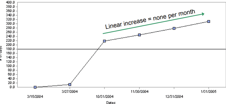
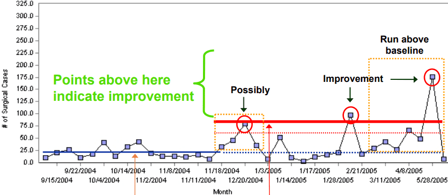
Number-between 3 X̄ rule[1]
Baseline average = 20.6 (horizontal blue line, thick on left, dotted on right) ↠
3 × 20.6 = 61.8 → Possibly (p≅0.05) [dotted horizontal orange line]
4 × 20.6 = 82.4 → Improvement (p<0.02) [thick red horizontal line]
Table 1. Number of zeros required to confirm improvement Events = number of events per year Zeros = number of months of consecutive zeros required for confirmation
Events
CL
3/CL
Zeros
1
0.08
36.0
36
3
0.25
12.0
12
6
0.50
6.0
6
12
3.00
3.0
3
15
1.25
2.4
3
18
1.50
2.0
2
21
7.75
1.7
2
24
2.00
1.5
2
References
Benneyan, James.
Measuring rare events and time-between measures
www.ihi.org.