Why use a CUSUM chart?
A major disadvantage of commonly used control charts is that they only use the information about the process contained in the last plotted point, and ignore any information given by the entire sequence of points. Shewhart type control charts have no memory: previous observations do not influence the probability of future out-of-control signals. Also, they are insensitive to small shifts.
The CUSUM chart uses an unweighted sum of all previous observations. This chart has a rather long memory. They are very effective if the magnitude of the shift is 1.5σ to 2σ or larger.
Another reason CUSUM charts are popular is their ability to mitigate risk. For example, consider incident reporting systems where adverse events need to be managed in a timely manner. A hospital cannot afford to wait until plot point falls outside ±3σ control limits before generating an alarm. Instead, they need greater sensitivity to small process changes.
When small changes in the mean (1 - 1.5σ) must be identified but very little data is available for process control purposes, the CUSUM chart is an excellent solution. It should be considered whenever data points are infrequent difficult to obtain (adverse events), or expensive (satisfaction surveys), and it is desirable to quickly detect small changes in the process operating level. Furthermore, they are particularly effective with samples of size `n = 1` as occurs with incident reports.
What is a CUSUM chart?
Like control charts, CUSUM charts are used to plot data in a time-series by plotting the cumulative sums of the deviations of the sample values from a target value. Each previous data point on the chart is given equal weight in the CUSUM statistic.
For example, suppose that samples of size ` n ≥ 1 ` are collected, and ` bar x_j ` is the average of the jth sample. Then if `mu_0` is the target for the process mean, the cumulative-sum control chart is formed by plotting the quantity
against the sample i.`C_i` is called the cumulative sum up to and including the `i`th sample. The analysis of a CUSUM run chart is purely visual. Neither the median nor the probability-based rules should be used in the analysis. If the process remains in control at the target value `mu_0`, the plot of the cumulative sum data will follow a horizontal pattern around the target. However, if the mean shifts upward to some value `mu_1 > mu_0`, then an upward or positive drift will develop in the cumulative sum `C_i`. Conversely, if the mean shifts downward to some `mu_1 < mu_0`, then a downward or negative drift in `C_i` will develop. Changes in the direction of the pattern will usually be explained by some change in the process under study and the plot of the CUSUM statistic can be useful in determining the specific time period when the impact of the special effect first occurred. Therefore, if a trend develops in the plotted points either upward or downward, we should consider this as evidence that the process mean has shifted, and a search for some assignable cause should be performed.
As the statistic is cumulative, all of the information in previous data values continues to be included in the CUSUM value plotted. After a special cause is detected and an appropriate reaction is taken, it is recommended to "restart" the CUSUM statistic at 0. Otherwise, the statistic would continue to indicate the special cause situation (another option when restarting the CUSUM series is to use a "fast initial response" (FIR) feature, restarting the CUSUM statistic to a fixed value rather than 0).
How are CUSUM charts created?
When compared with traditional control charts, the tabular CUSUM chart is unique, and certain parameters and statistics must be used in its creation.
| Parameter | Description |
|---|---|
| `sigma` | ` sigma = sqrt((Sigma(x-bar x)^2)/(n-1)) ` |
| `mu_0` | The process mean (average of the data series), a reference value, or a target (goal).。 |
| `k` | Half the magnitude of the mean shift value to detect. The value `k` can range from `0.2` to `1.0`, but it is usually selected as `0.5` to best match the risks of a Shewhart chart for a stable process. |
| `K` | `=k sigma`
The shift in process mean that the CUSUM is meant to detect, in standard deviation units. Typically between `0.5 sigma` and `1.5 sigma`. |
| `h` | Decision parameter factor for determing decision interval `H`. The value of `h` is usually set at 4 (when `k = 0.5`) to match the performance of the traditional Shewhart chart, but other combinations of `k` and `h` can be selected to meet specific objectives for the chart. |
| `H` | `=h sigma`
`H` is the "Decision Interval" which acts as a control limit. The control limits are set at plus or minus `h sigma ` from `0` (target). In analyzing a CUSUM chart, the only rule for detecting special cause used is a point(s) beyond the limits. Either of the plotted series `C_i^+` or `C_i^-` going outside the control limit is an indication of a special cause. |
| ` C_i^+ ` | the cumulative sum of values above the target up to and including the `i`th sample. |
| ` C_i^- ` | the cumulative sum of values below the target up to and including the `i`th sample. |
| `FIR` |
`= (1/2)H`
Fast Initial Response or "head start" is typically half of `H` and is treated as the initial CUSUM value when no data exists. |
` C_i^+ = max[0\, x_i - (T + k sigma) + C_(i-1)^+]`
` C_i^-``= min[0\, x_i - (T - k sigma) + C_(i-1)^-]`
or, to give a result above zero
` C_i^-``= max[0\, (T - k sigma) - x_i + C_(i-1)^-]`
Data
(use the first 20 to calculate process mean and standard deviation)
            50.453, 50.682, 49.686, 49.572, 51.333, 50.280, 49.240, 50.478, 49.263, 50.046,
            49.540, 49.270, 50.316, 49.512, 49.895, 50.014, 49.373, 50.523, 51.111, 50.044,
            51.601, 50.479, 49.089, 50.632, 50.373, 51.682, 50.521, 51.639
Steps to complete Table 2
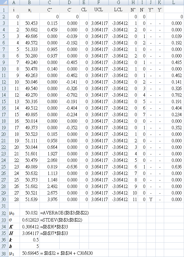
B1 : "xi " (the data from above for each sample)
C1 : "`C_i^+` " (calculated cumulative sum using equation above)
D1 : "`C_i^-` " (calculated cumulative sum using equation above)
E1 : "CL " (center line)
F1 : "UCL " (upper control limit)
G1 : "LCL " (lower control limit)
H1 : "`N^+` " (consecutive count of points above zero)
I1 : "`N^-` " (consecutive count of points below zero)
J1 : "`Y^+` " (Y = yes if `C_i^+` point exceeds UCL)
K1 : "`Y^-` " (Y = yes if `C_i^-` point below LCL)
A3 : "=A2+1"
drag (copy formula) A3 to A30 so that …
A30 : "=A29+1"
check that the result is a sample sequence from A2:A30 of 0~28
Use an Excel named range for your data column (for example, "$B$3:$B$30" as "myData")
A33 : "`sigma`"
A34 : "K"
A35 : "H"
A36 : "k"
A37 : "h"
A38 : "`μ_1`"
B32 : "=AVERAGE($B$3:$B$22)"
B33 : "=STDEV($B$3:$B$22)"
B34 : "=$B$36*$B$33" (K = kσ)
B35 : "=$B$37*$B$33" (H = hσ)
B36 : "0.5"
B37 : "5"
D2 : "0"
D3 : "=MIN(0,B3-($B$32-$B$34)+D2)"
Select C3 together with D3, then drag (copy formula) through to D30 so that …
C30 : "=MAX(0,B30-($B$32+$B$34)+C29)"
D30 : "=MIN(0,B30-($B$32-$B$34)+D29)"
Column L uses the second formula for `C_i^-` to check the result in column D.
` C_i^-``= max[0\, (T - k sigma) - x_i + C_(i-1)^-]`
L3: "=MAX(0,($B$32-$B$34)-B3+L2)"
F3:F30 : "=$B$35" (`H = h sigma` where `h=5`)
G3:G30 : "=-$B$35" (has a leading minus sign)
K3 : "=IF(D3<=G3,"Y","-")"
Select J3 together with K3, then drag (copy formula) through to K30 so that …
J30 : "=IF(C30>=F30,"Y","-")"
K30 : "=IF(D30<=G30,"Y","-")"
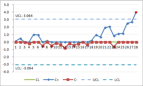
Check that your result is a "Y" in cell J30.
I2 : "0" (set `N_0^+` start to zero)
H3 : "=IF(C3>0,H2+1,0)"
I3 : "=IF(D3<0,I2+1,0)"
Select H3 together with I3, then drag (copy formula) to I30 so that
H30 : "=IF(C30>0,H29+1,0)"
I30 : "=IF(D30<0,I29+1,0)"
Check that your result shows that where cell J30 shows "Y", `N_28^+`= 11.
`mu_1 = mu_0 + K + (C_i^+ \/ N_i^+)`
where `C_i^+` is the value of `C^+` when the control limit was exceeded, and `N_i^+` is the number of consecutive points above zero when the control limit was exceeded. So in this example, `N_28^+`= 11 with `C_28^+`= 3.976.The altered process mean `mu_1` (or `bar x_1`)
= 50.699
`mu_1 = mu_0 - K - (C_i^+ \/ N_i^+)`
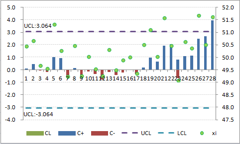
Once the process has been adjusted back to target, the values of `C_i^+` and `C_i^-` are set back to zero. However, there is a technique called Fast Initial Response (FIR) in which the values are not set back to zero, but are set to a certain value, usually 2 standard deviations. This provides a method of responding faster to off-target operations. You can also start a CUSUM chart with a FIR.Figure 3 shows the result when the FIR method is used to initialize the chart in Figure 2 using two standard deviations instead of zero. That is, in Table 2, make the following changes:
D2 : "=-2*$B$33" (has a leading minus sign)
You can see from this chart that both `C_i^+` and `C_i^-` are further away from 0 than in Figure 1. If the process is off target, then the CUSUM control chart will pick it up faster. If it is on target, the CUSUM values will trend back to zero as shown by data point 7.

The tabular cusum used in the basic example above has a single measurement in each sample (subgroups n = 1). Cusum can also be used for the averages of rational subgroups (n > 1), for example, the averages of likert scores on a satisfaction survey each day at an outpatient clinic. In this case, replace σ by `σ_x = σ ÷ sqrt(n)`. With Shewhart charts, the use of averages of rational subgroups substantially improves control chart performance.
However, this does not always happen with the cusum. If, for example, you have a choice of taking a sample of size n = 1 every half-hour or a rational subgroup sample of size n = 5 every 2.5 hours (note that both choices have the same sampling intensity), the cusum will often work best with the choice of n = 1 every half-hour. Only if there is some significant economy of scale or some other valid reason for taking samples of size greater than one should subgroups of size greater than one be used with the cusum.
Example: Satisfaction survey
This section uses satisfaction surveys as the example, based on a 5-point Likert scale for answering a question about the effects of a quality improvement strategy.
The scenario was an outpatient clinic for a single doctor. The quality improvement team were using PDSA methodology, and wanted to test the effectiveness of a strategy that they designed to resolve a problem that patients complained of in the free-text section of satisfaction questionnaires.
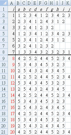
Each patient, as they left the clinic after seeing the doctor, was asked to rate the result using a 5-point Likert scale (1=very unhappy, 5 extremely satisfied). Table a1 shows the Likert score given by each patient (a~j). Rows indicate "day at clinic", for example, all the survey results for day 1 are in B2 to K2 {1, 2, 3, 4, 1, 2, 3, 4, 2, 3}.
Baseline data for one week (7 days), shown by a thick black line between day 7 and day 8.
From day 8, the new method was continued for another two weeks.
The result of interest was improvement, so a one-sided CUSUM `C^+` was used. Data was analysed in the following ways:
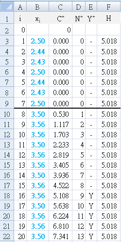
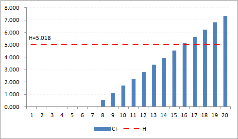
- Each day, the average satisfaction was calculated and used as a single data value (n=1) to calculate (Table a2) and graph (Figure A2) the result.
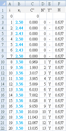
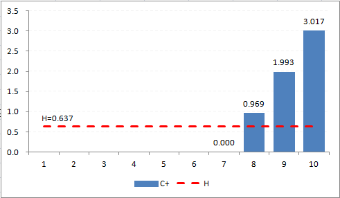
- Each day, the average satisfaction was calculated and used as a single data set (n>1) containing multiple values (different number of patients each day). The calculations were adjusted to reflect this (Table a3) and graph (Figure A3) by replacing σ with `sigma_x = sigma ÷ sqrt(n)` (Figure A1a)
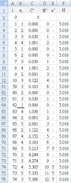
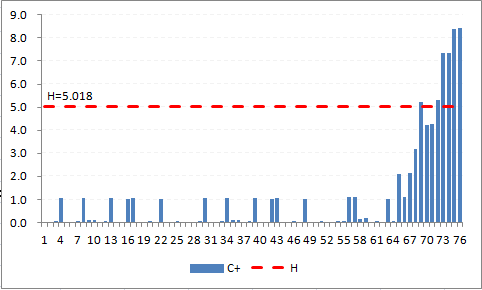
- Each patient value (n=1) was used to calculate the CUSUM values (Table a4) and graph (Figrue A4). There were 62 patient surveys collecting during the baseline period.
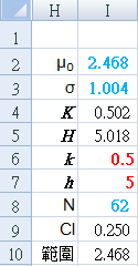
Set CUSUM parameters manually:
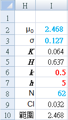
k and h
{red numbers}
Calculated from raw data {blue numbers}:
I2: "=AVERAGE($B$3:$K$9)"
I3: "=STDEV($B$3:$K$9)"
I8: "=COUNT($B$3:$K$9)"
Derived CUSUM calculations:
I4: "=$I$6*$I$3"
I5: "=$I$7*$I$3"
I9: "=CONFIDENCE(0.05,$I$3,$I$8)"
J10: "=CONCATENATE(TEXT($I$2-$I$9,"0.000"),"~",TEXT($I$2+$I$9,"0.000"))"
I3: "=STDEV($B$3:$K$9)/SQRT($I$8)"
Results
All three methods show that the baseline system was breached starting from day 8, however, they differed in how early the change was detected.
Using the Excel function to calculate 95% confidence interval, the average satisfaction during the two periods was:
Baseline: 2.468 (2.218 ~ 2.718)
After strategy: 3.536 (3.468 ~ 3.603)
By looking at the core calculation area, we can see that the CUSUM has detected an increase (change)
-
Table a2 first detects the change (`Y^+`= "Y") at E18, which is day 16, 9 days after the improvement strategy was begun. Using `N^+` to backtrack, we can see that the change started (`N^+` = "1") on day 8.
The result is easily seen in Figure A2, where the first positive bar column appears at day 8, and the decision interval (H=5.018) is breached at day 16. -
Table a3 first detects the change (`Y^+`= "Y") at E10, which is day 8, 1 day after the improvement strategy was begun.
The result is seen in Figure A3, where the first positive bar column appears at day 8, and immediately breaches the decision interval (H=0.637). -
Table a4 first detects the change (`Y^+`= "Y") at E71, which is patient 69, the fifth patient on day 8, the day that the improvement strategy was begun.
The result is easily seen in Figure A4, where the consistently positive bar columns appear at patient 63, and reaches the decision interval (H=5.018) by patient 69.
References
-
Provost LP, Murray SK.
The health care data guide. Learning from data for improvement.
(2011)
John Wiley & Sons Inc, San Francisco.
[ www.josseybass.com/go/provost] -
Morton AP, Whitby M, McLaws ML, Dobson A, McElwain S, Looke D, Stackelroth J.
The application of statistical process control charts to the detection and monitoring of hospital-acquired infections.
J. Qual. Clin. Practice. 2001; 21: 112-117.
[ https://www.ncbi.nlm.nih.gov/pubmed/]