Hospital Acquired Infection
When employed with monthly counts of infections, Shewhart, CUSUM, and EWMA control charts can be used without denominator data, which in infection control programmes are often difficult to identify and frequently time-consuming to collect. This is provided that the adverse event rate does not exceed 10%.
Alteration in infection rates may be represented by a sudden large increase in infection numbers or a sustained rise in the mean infection rate. Because a Shewhart chart is better at detecting the former, and CUSUM and EWMA charts the latter, they are best employed together.
CUSUM Observational Chart
CUSUM Statistical Test
Visual Interpretation
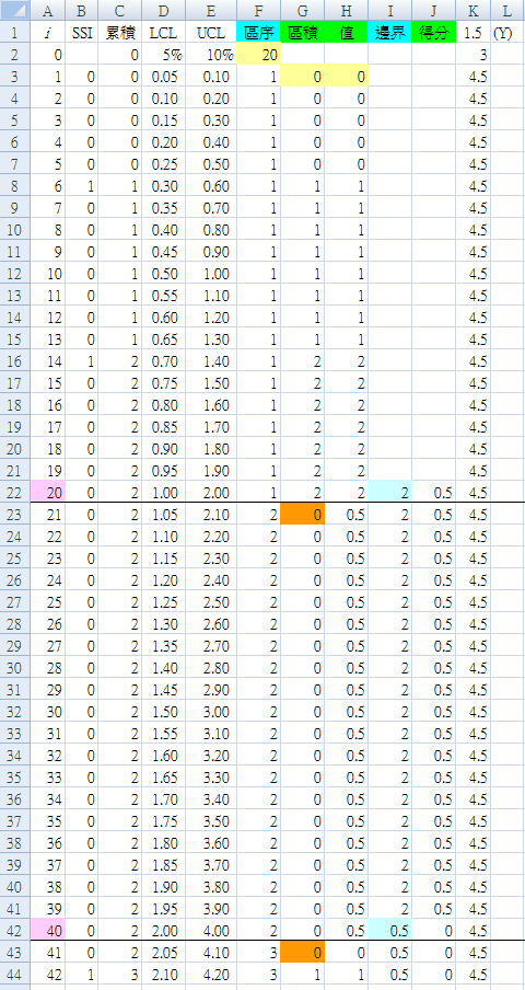
Mark the block borders. In column A, for every 20 ($F$2) procedures, mark the end of the block with a pink background; that is, i=20, 40, 60, 80, 100, 120, 140, 160, 180 at A22, A42, A62, A82, A102, A122, A142, A162, A182.
Table 4 has added a thick black line at the end of each block to make this clearer.
Note that the first CUSUM after each block border is reset to zero. In column G, after every 20 ($F$2) procedures, the start of the following block is shown with an orange background; that is, i=21, 41, 61, 81, 101, 121, 141, 161, 181 at G23, G43, G63, G83, G103, G123, G143, G163, G183.
The CUSUM Value at the end of each block is indicated with a light blue background in column I: i=20, 40, 60, 80, 100, 120, 140, 160, 180 at I22, I42, I62, I82, I102, I122, I142, I162, I182.
Column I (CUSUM border), changes each block to make sure it reads the final value for the previous block (the one we just marked with a light blue background).
Rapid Template
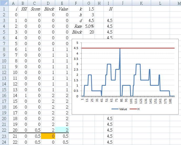
After you have understood the basic method by using the above step-by-step example, use the following version to make re-use easier for future examples.
B1 : "SSI"
C1 : "Score"
D1 : "Block"
E1 : "Value"
| F1 : "k" | G1 : "1.5" |
| F2 : "h" | G2 : "3" |
| F3 : "d" | G3 : "=G1+G2" |
| F4 : "Rate" | G4 : "0.05" |
| F5 : "Block" | G5 : "=1/G4" |
D2 : "0"
E2 : "0"
D3 : "=IF(MOD(A3,$G$5)=1,0,(B3+D2))"
E3 : "=IF(A3<=$G$5,(B3+E2),IF(E2>=$G$3,0,(D3+C2)))"
Application of this method in a certain hospital
Surgical Procedure #1
From December 2001 to August 2016, 867 operations with 40 SSI, an infection rate of 4.6%. The operations are listed in sequence, and the following sequence numbers indicate which procedures developed SSI:
				9, 11, 19, 24, 30, 48, 58, 74, 80, 110,
				113, 130, 135, 151, 186, 189, 228, 239, 273, 293,
				319, 337, 339, 380, 384, 437, 458, 480, 482, 484,
				523, 529, 553, 611, 702, 733, 750, 793, 809, 810
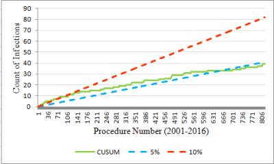
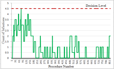
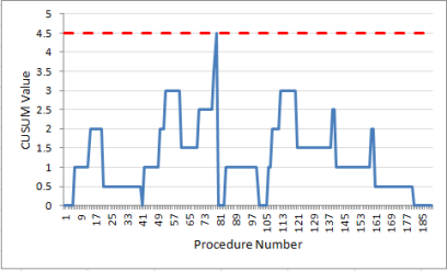
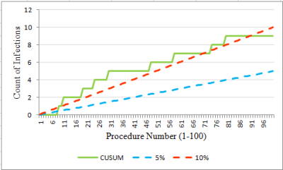
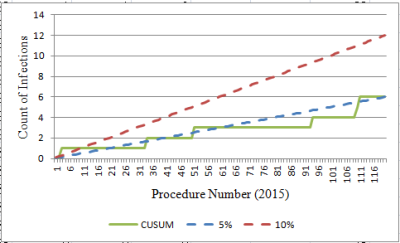
Interpretation: In the early period (first 100 procedures), the CUSUM value for count of infections is on or above the UCL of 10% for most of the time (Figure 6). And the threshold is breached at procedure number 80 (Figure 7). Thereafter, the SSI count levels off, then dips towards the LCL so that by the most recent year, it is below 5%. To explore these two periods further, the data were divided into two periods: Figure 8 (the first 100 procedures) and Figure 9 (the most recent year). The graphs are evidence that marked improvement (reduction) in the SSI rate for this particular procedure has occurred.
Practice Examples
For each procedure:
- Draw the CUSUM observational chart
- Draw the CUSUM statistical test chart
- Interpret the result
Surgical Procedure #2
From October 2000 to August 2016, 771 operations with 57 SSI, an infection rate of 7.4%. The operations are listed in sequence, and the following sequence numbers indicate which procedures developed SSI:
					21, 27, 43, 45, 46, 48, 49, 51, 52, 58,
					69, 80, 82, 87, 90, 95, 96, 98, 100, 101,
					106, 113, 119, 120, 125, 137, 140, 161, 164, 170,
					173, 185, 209, 215, 224, 243, 257, 273, 285, 298,
					307, 310, 313, 318, 331, 337, 360, 373, 403, 440,
					638, 658, 687, 705, 715, 716, 743
Surgical Procedure #3
From September 2001 to February 2016, 469 operations with 20 SSI, an infection rate of 4.3%. The operations ae listed in sequence, and the following sequence numbers indicate which procedures developed SSI:
					30, 33, 42, 43, 45, 46, 58, 139, 235, 255,
					274, 321, 324, 340, 401, 404, 420, 436, 446, 465
Patient Satisfaction
Data
					82, 79, 84, 82, 92, 80, 94, 78, 83, 84, 92, 84,
					89, 88, 93, 84, 98, 92, 87, 94, 93, 95, 91, 84,
					95, 92, 95
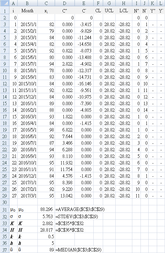
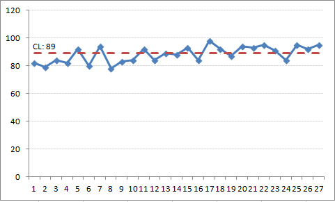
The data is monthly patient satisfaction, expressed as a percentage derived from the top-two box indicator (the number of patients giving 4 or 5 on a Likert scale of 1-5). The monthly satisfaction is shown as a run chart (trend line) in Figure 10, using the median value of 89% for the centerline. The run chart shows no signal of improvement by any of the statistical tests for non-random variation.
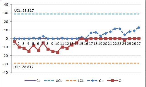
Figure 11 is the CUSUM for these data, using the system mean (88.296) as target (goal). This shows a gradual continued change from the target (zero centerline), after the introduction of process changes around i = 16, despite some previous months with poor performance (below centerline). This is visually more obvious in the CUSUM chart in comparison to the run chart (where none the run chart rules were flagged).
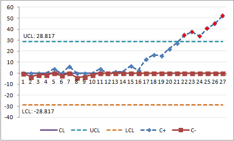
Figure 12 is the CUSUM for the same data, but using a target of 85%. (To see this effect in your Excel worksheet, change cell C31 to "85") The CUSUM chart shows a flat slope initially, indicating that performance is near the target. The slope starts to rise (remains above the centerline) at i = 11 and crosses the H threshold (UCL) at i=22, indicating that monthly performance is greater than the target of 85%. The process slope continues to climb indicating continued performance above the target (the last 6 data points).
Continue to use the worksheet with a goal of 85%, and reset `C_i^+` to a FIR of `2sigma`
C23: "=2*$C$32"
Note that the CUSUM line continues to rise and appears it will reach the H upper control limit again after four more data points.
Risk Stratification
Figure 13 shows CUSUM graphs for wound infections (SSI) for appendectomies in one year at a certain hospital. 13(a) is all of the operations for the year using the hospital goals to define lower limit of 1.5% and an upper limit of 3.25%. 13(b) is the same hospital data, but with peer group statistics added from the NHSN database for the same period. 13(c) stratified by NHSN risk (0,1) and 13(d) stratified by NHSN risk (2,3). Dotted lines indicate the NHSN peer group levels.
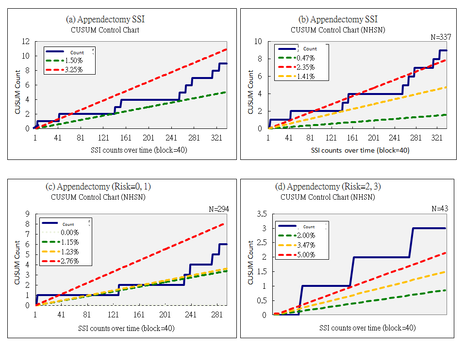
Interpretation: Although the hospital has met its own goals over the course of time (13a), by comparison with the NHSN peer group (13b) it hovers around the upper limit (dotted red line) over the right third of the graph, and continues to worsens until the results are above the upper limit of 2.45%. However, risk stratification shows that this effect is not present in risk categories 0 and 1 (13c), but is pronounced in risk categories 2 and 3 (13d) throughout the year, being well above the upper limit for that group of 5%. This is the group that quality improvement needs to focus on.
Skill Assessment
Cusum failure analysis is useful in monitoring performance in procedures performed for health care. The most difficult aspect is determining what is an acceptable and an unacceptable failure rate. Results are presented in two types of graph:
- number of cumulative failures on the vertical (y) axis, against the attempt number on the horizontal (x) axis. Thus a zero failure rate would result in a horizontal line, but a 100% failure rate would result in a 45 degree line through the axis. As the cumulative failure rate can never go down, the graph will rise, but does provide simple intuitive information about crude success or failure rates at defined counts of procedures. (see HAI section above for examples)
- Cusum value plotted on the y axis against the attempt number on the x axis. At acceptable levels of performance, the CUSUM curve is flat or sloping downwards, while at unacceptable levels of performance, the curve slopes upward and eventually crosses a decision interval.
Plotting the Cusum is ideal for long-term performance surveillance (as in continuous professional development), as it is easy to identify a change in performance after a period of either acceptable or unacceptable performance. This is much more difficult to identify on the cumulative failure graph.
However, the cumulative falure graph is used to monitor trainees, often by adding "alert" lines with a higher type 1 error in the same calculations to alert the trainer that a trainee is approaching unacceptable performance.
Performance is measure as a binary outcome (success versus failure of procedures) with 1 indicating failure. What is "acceptable" and what is "unacceptable" has to be specified explicitly before beginning to monitor. Ideally these should be based on universally accepted standards published by authoritative medical professional bodies. Unfortunately, such performance standards are rare, or are in the process of being established. Until then, specialists involved in the monitoring should decide on the standards first.
Where CUSUM monitoring has been tested, the doctors who participated found the technique acceptable, particularly as a personal self-assessment tool. However, they were less certain of its acceptability as a basis for credentialing.
Although the use of SPC is well established in some disciplines like laboratory medicine, its application in clinical care processes poses special challenges. Shewart charts are designed to detect a large but transient shift in the process mean, typically in large-volume manufacturing processes. This limits their application in the clinical care process for two reasons.
- Firstly, the the throughput of the clinical process is typically very slow; for example, a surgeon may perform no more than one to five procedures a day. It is both undesirable and inconvenient for a performance monitoring system to require sample sizes of greater than one to accumulate before analysis.
- Secondly, for clinical care, even a small shift in process mean is of concern; for example, adverse deterioration in mortality rate, complication rate, or procedure failure rate. Clinical monitoring requires early warning of poor performance before too many adverse outcomes have occurred.
CUSUM charting is objective and has great visual appeal. For trainees, it literally shows a learning curve and how an individual is making progress over time with more practice. This can complement the current system that relies on inspection by external observer, and is certainly better than relying on performance of an arbitrary number of procedures before competence is assumed. Doctors do have varying learning curves.
Type 1 error: odds of falsely accusing an operator of being incompetent α
Type 2 error: odds of falsely certifying someone as competent β
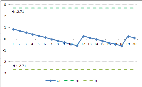
The CUSUM graph is said to signal when `C_n` crosses a predetermined decision interval, `H`.`H_0` denotes the value between each acceptable decision level. These intervals can be marked as horizontal lines on the CUSUM graph. When a line is croseed, `C_n` traditionally reverts to zero, but a learning curve can be constructed if repeated decision intervals are stacked graphically.
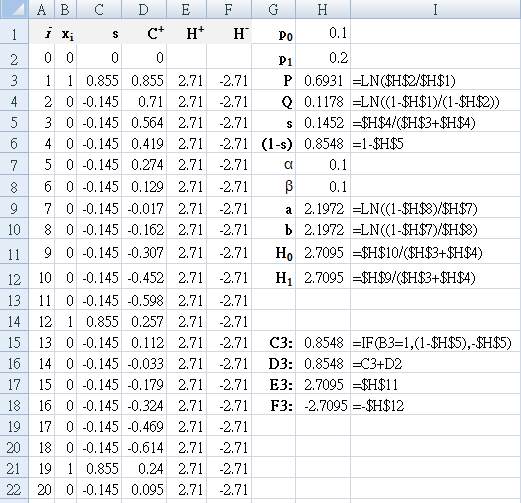
Commonly used values: acceptable failure rate `p_0` = 0.1 (10%),
unacceptable failure rate
`p_1` = 0.2 (20%), `α` = 0.1, `β` = 0.1
`P = ln(p_1 \/ p_0)\, Q=ln((1 - p_0) \/ (1-p_1)) `
The success of the procedure `s` is calculated from the two rates, as is the failure
`(1-s)`.
`p_0 = 0.1\, p_1 = 0.2\, s = 0.15\, (1-s) = 0.85`
`a = ln((1 - β) \/ α)`
`b = ln((1 - α) \/ β)`
`H_0 = b \/ (P+Q) = 2.71`
`H_1 = a \/ (P+Q) = 2.71`
CUSUM Interval Control Charts
With the tighter control that is available with CUSUM schemes, there is more emphasis placed on keeping the process on aim rather than allowing it to drift off limits. Because of the tighter control, an out-of-control signal will seldom indicate that the process is producing nonconforming product; rather, an out-of-control signal will indicate that control action should be taken to prevent the production of nonconforming product. Because CUSUM procedures give an early indication of process changes, they are consistent with a management philosophy that encourages doing it right the first time. The use of CUSUM procedures is also consistent with a management-by-exception philosophy, as the CUSUM will point out areas needing attention.
Lucas (1985) defines a Poisson CUSUM for number of counts observed per sampling interval (g-chart), and a time-between-events CUSUM (t-chart). The g-chart can be used to count the number of good units (for example, operations) between occurrences of bad units (for example, surgical site infection). In addition to manufacturing scenarios, potential applications include monitoring time between accidents, clerical studies in which the time between one or more errors in paperwork occur, or the rate of occurrence of congenital malformations. The term count
is preferred to nonconformances
, as counts
has a broader applicability. For g-charts, it is desirable to have the time between defects (or number of good units between consecutive bad units) be as large as possible. A t-chart is useful in detecting a change in the time between events and would signal if the number of good units produced has decreased, indicating that the rate of production of bad units (defects, infections) has increased.
Error rates can be measured as defects per {monitored number of} units
(for example, defects per million units, DPMU) and defects per {monitored number of} opportunities
(for example, defects per million opportunities, DPMO) Using surgical antibiotic prophylaxis as an example, for each operation that it is used for, there are several steps involved: choice of antibiotic, dosage, and time given (which has three parts: preoperative, interoperative, and cessation postoperatively). If all comply with the protocol, then that patient is counted as being treated correctly
; if any of the items does not comply (for example, preoperative antibiotic given too early, postoperative antibiotic not ceased), then the patient is counted as incorrect
(deficit, nonconformance). That is, each patient is counted as a single unit, and scored as Yes
(fully compliant) or No
in regards to established protocol. This is the DP{M}U
indicator, where the denominator is the number of patients given surgical antibiotic prophylaxis. Separately, each step of the procedure is monitored, so that there are five opportunities for each patient to not comply with the protocol.
This is the DP{M}O
indicator, where the denominator is the number of patients given surgical antibiotic prophylaxis multiplied by the number of steps involved. This is the DP{M}O indicator, where the denominator is the number of patients. Both measures are important, and can be monitored using t-chart and g-chart CUSUM control charts.
CUSUM control schemes are usually evaluated by calculating their average run length (ARL). The ARL is the average number of samples taken before an out-of-control is obtained. The ARL should be large when the process is at its aim level and short when the process shifts to an undesirable level. In many industries, the in-control ARL for DPMU is set at approximately 100; while the in-control ARL for DPMO may be 1000. The in-control ARL for DPMO is considerably larger than for DPMU to protect against the process signalling out of control, when in fact, it is in control (that is, protect against false alarms).
Design of counted data CUSUMs
- Choose the reference value `k` by using the acceptable rate `u_a` and the average count rate that is to be detected `u_d` quickly.
Although the desired value (or goal) for `u_a` is often zero, a value of zero is usually not used in the design formulas. In practice, `u_a` is often chosen near to the current mean level; this represents current system performance. The reference values should be selected to be close to:For a good events between two bad events CUSUM (g-chart) {POISSON}
Direction `k_p = (μ_d - μ_a)/(ln(μ_d) - ln(μ_a))`For a time-between-events CUSUM (t-chart) {TBE}
`k_b = (ln(μ_d) - ln(μ_a))/(μ_d - μ_a)` - Choose the decision interval value `h` from tables in Lucas (1985), primarily determined by the desired in-control ARL; that is, the acceptable frequency of false out-of-control signals. Guard against an initial out-of-control situation by using the ARL tables for the FIR CUSUM. The relevant tables in Lucas (1985) are as follows (
Direction
means the change in direction would indicate an increase in defects/ decrease in quality):
Table 7. Lucas lookup tables for decision interval Direction g-chart
{POISSON}t-chart
{TBE}Increase Table 3 Table 10 Decrease Table 5 Table - For a time-between-events CUSUM (t-chart), the `h` is selected from an ARL table that uses a normalized reference value `k_t = k_b × μ_a` or may be determined from the `μ_d ÷ μ_a` ratio:
`k_t = ( ln(μ_d ÷ μ_a )) / ((μ_d ÷ μ_a) - 1 )`
As the time between events is reported on a continuous scale, interpolation in the tables may be required. The interpolation ARL can be found using logarithmic interpolation (linear interpolation in LN(ARL)) between the two closest `k` values at a constant `(h ÷ k)` ratio.`x = x_2^f × x_1^(1-f)` (Deserno M)
The `h_t` value obtained from the table is normalized to obtain the decision interval value (`h_b`) used by the control scheme with `h_b = (h_t ÷ μ_a)`. - Use the `C_i^+` and `C_i^-` equations above to calculate.
Simplified calculation of ARL
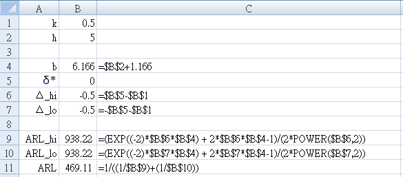
`ARL = (exp(-2Δb) + 2Δ -1) / (2 Δ^2)` (Siegmund's approximation, Montgomery p.323)
for `Δ \ne 0` (if `Δ=0` use `ARL = b^2`)
- Start a new worksheet to test for for a two-sided cusum with `k=1 / 2, h=5`.
- Enter the parameter names in column A as shown in Figure 15.
- Set `k=1 \/ 2` → B1 = 0.5
- Set `h=5` → B2 = 5
- Enter the equations shown in Column C into the cell immediately to their left in Column B
- For the in-control state (no shift from the mean, that is, `δ^* = 0`)
Set `δ^* = 0` → B5 = 0 - Make sure your result is: `ARL = 469.1`
Example: two-sided time-between-events CUSUM
For accident data, it is valuable to update with CUSUM with each new occurrence.
Design the CUSUM on a rate/month basis and then convert to a daily basis for implementation.
(Table 15 in Lucas JM. Counted data CUSUM's. Technometrics. 1985; 27(2): 129-144)
- Import the data into an Excel worksheet. Confirm that the data was converted to the DATE datatype.
- Set up an adjacent column to calculate the number of days since the previous accident for each accident.
- Use the first five years of data to calculate the average accident level `u_a`
- Set the level of process to be monitored `δ^* = 1`, and use it to calculate the nonconformance (defect) rates `u_d` for the increase side and decrease side of the two-sided CUSUM.
- Calculate: `k_b = (ln(u_d) - ln(u_a) / (u_d - u_a)` for both increase and decrease sides.
- Use 30 as the number of days in a month, and recalculate `k_b` in days:
`k_b = k_b × 30` - Use Lucas tables to find appropriate `h_t` using the FIR feature.
- For implementation, use
`h_b = h_t \/ u_a` and `S_0 = h_b \/ 2` - Calculate the CUSUM values for each side using equations already discussed above
`S_i = max(0\, k_b - Y_i + S_(i-1))`
Solution: two-sided time-between-events CUSUM
| Parameter | Increase | Decrease |
|---|---|---|
| `u_d` | 3.0 | 1.0 |
| `k_b` | 0.41 | 0.69 |
| `k_b` (days) | 12.3 | 20.7 |
| `h_t` | 5.6 works for both | |
For implementation use `h_b = h_t / u_a = 5.6 / 2 = 2.8` months, or 84 days with `S_0 = 42` days.
Implementing the CUSUM to detect an increase in rate using
`S_i = max(0\, 12 - Y_i + S_(i-1))`
gives no signals in the first five years of data, and there is no (false) detection of an increase in the second five years of data.
Implementing the CUSUM to detect a decrease in rate using
`S_i = max(0\, 12 - y_i + S_(i-1))`
gives no false signals in the first five years, and gives the first signal indicating a decrease in mean using data points 128-130. If the CUSUM is restarted using the FIR feature, the CUSUM would signal again after four more observations.
An HIV/AIDS example
Implement a CUSUM graph for the data below and interpret your findings. Data from Table 1 in [Adeoti OA]
| Month | 2001 | 2002 | 2003 | 2004 |
|---|---|---|---|---|
| 01 | 31 | 33 | 33 | 36 |
| 02 | 45 | 48 | 48 | 28 |
| 03 | 41 | 47 | 26 | 24 |
| 04 | 40 | 25 | 26 | 43 |
| 05 | 53 | 28 | 30 | 32 |
| 06 | 48 | 18 | 41 | 26 |
| 07 | 55 | 36 | 40 | 44 |
| 08 | 71 | 23 | 27 | 25 |
| 09 | 56 | 31 | 49 | 48 |
| 10 | 64 | 14 | 41 | 51 |
| 11 | 47 | 6 | 51 | 41 |
| 12 | 47 | 16 | 13 | 46 |
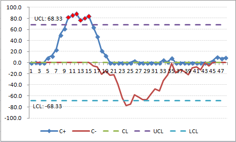
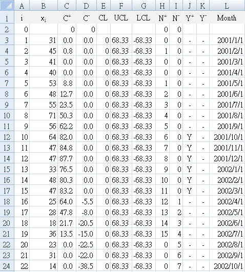
D3:"=MIN(0,B3-($B$52-$B$54)+D2)"
E3:"0"
F3:"=$B$55"
G3:"=-$B$55" (leading minus sign)
H3:"=IF(C3>0,H2+1,0)"
I3:"=IF(D3<0,I2+1,0)"
J3:"=IF(C3>=F3,"Y","-")"
K3:"=IF(D3<=G3,"Y","-")"
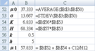
References
- Montgomery DC. Introduction to statistical quality control. 3rded. John Wiley & Sons Inc. 1997
- Provost LP, Murray SK. The health care data guide. Learning from data for improvement. John Wiley & Sons Inc, San Francisco. 2011
- Morton AP, Whitby M, McLaws ML, Dobson A, McElwain S, Looke D, Stackelroth J. The application of statistical process control charts to the detection and monitoring of hospital-acquired infections. J. Qual. Clin. Practice. 2001; 21: 112-117.
Risk Stratification
-
Coory M, Duckett S, Sketcher-Baker K.
Using control charts to monitor quality of hospital care with administrative data.
Int J Qual Health Care. 2008; 20(1): 31-39.
[
www.ncbi.nlm.nih.gov/pubmed]
Uses risk-adjusted, expected-minus-observed CUSUM control charts for 30-day, in-hospital mortality rate following admission for acute myocardial infarction. -
Noyez L.
Control charts, Cusum techniques and funnel plots. A review of methods for monitoring performance in healthcare.
Interact CardioVasc Thorac Surg. 2009; 9(3): 494-499.
[
doi: 10.1510/icvts.2009.204768]
Includes a discussion of CUSUM charts including cumulative failure chart, standard non-risk-adjusted CUSUM chart, risk-adjusted CUSUM chart, and funnel plots, especially in cardiac surgery.
Skill Assessment
-
Lim TO, Soraya A, Ding LM, Morad Z.
Assessing doctors’ competence: application of CUSUM technique in monitoring doctors’ performance
- Starkle T, Drake EJ. Assessment of procedural skills training and performance in anesthesia using cumulative sum analysis (cusum). Can J Anaesth. 2013; 60 (12): 1228-39.
- Campbell RD, Hecker KG, Biau DJ, Pang DSJ. Student Attainment of Proficiency in a Clinical Skill: The Assessment of Individual Learning Curves PLoS One. 2014; 9(2): e88526.
- Naik VN, Devito I, Halpern SH. Cusum analysis is a useful tool to assess resident proficiency at insertion of labour epidurals. Canadian Journal of Anesthesia. 2003; 50(7): 694-8.
- Bould MD, Crabtree NA, Naik VN. Assessment of Procedural Skills in Anaesthesia Br J Anaesth. 2009; 103(4): 472-483.
- Norris A, McCahon R. [editorial] Cumulative sum (CUSUM) assessment and medical education: a square peg in a round hole Anaesthesia 2011; 66(4): 250-254.
- Calsina L, Clara A, Vidal-Barraquer F. The Use of the CUSUM Chart Method for Surveillance of Learning Effects and Quality of Care in Endovascular Procedures
- MacKenzie Kr, Aning J. Defining competency in flexible cystoscopy: a novel approach using cumulative Sum analysis BMC Urology 2016; 16:31
- Kemp SV, El Batrawy SH, Harrison RN, Skwarski K, Munavvar M, Roselli A, Cusworth K, Shah PL. Learning curves for endobronchial ultrasound using cusum analysis. thorax.bmj.com/content/65/6/534.full.pdf
- RCOA bulletin 54 - The Royal College of Anaesthetists https://www.rcoa.ac.uk/system/files/CSQ-Bulletin54.pdf Mar 18, 2009 - A learning curve for all – CUSUM curves in initial assessment of competency. Page 13
- Komatsu R, Kasuya Y, Yogo H, Sessler DI, Mascha E, Yang D, Ozaki M. Learning Curves for Bag-and-mask Ventilation and Orotracheal Intubation: An Application of the Cumulative Sum Method Anesthesiology 2010; 112: 1525-1531.
- Ospina ODA, Medina AMR, Marulanda MC, Buitrago LMG. Cumulative Sum learning curves (CUSUM) in basic anaesthesia procedures Colombian Journal of Anesthesiology 2014; 42(3): 142-153.
CUSUM Interval Control Charts
-
Lucas JM.
Counted data CUSUM's
. Technometrics. 1985; 27(2): 129-144 - Borror CM, Kerts JB, Montgomery DC. Robustness of the time between events CUSUM. International Journal of Production Research. 2003; 41(15): 3435-3444
- Deserno M. Linear and Logarithmic Interpolation 2004-03-24 [ www.cmu.edu/biolphys/deserno]
An HIV/AIDS example
- Adeoti OA. Application of Cusum Control Chart for monitoring HIB/AIDS patients in Nigeria International Journal of Statistics and Applications 2013; 3(3): 77-80. [ DOI: 10.5923/j.statistics.20130303.07]


