- Funnel plots are graphical tools to compare the clinical performance of care institutions (or groups of care professionals).
- The comparison is made using a quality indicator against a benchmark.
- It is especially useful when denominator sizes vary.
- Indicator values of each group are plotted on the y-axis against the sample size (denominator) of that group on the x-axis.
- As the sample size increases, the control limits narrow, resulting in the characteristic funnel shape.
Current demand for accountability and efficiency of healthcare organizations, combined with the greater availability of routine data on clinical care and outcomes, has led to an increased focus on statistical methods in healthcare regulation. A funnel plot is a way of visualizing data for an indicator. It consists of 2 main parts: a funnel and a scatter plot. [1] In essence, the funnel plot consists of the funnel being superimposed on the scatter plot.
- The scatter plot represents indicator results for health organizations. Each dot represents a hospital's or a health region's indicator result, relative to its denominator size or service volume.
- The funnel is a mathematical creation (also known as statistical margins of error) that illustrates boundaries signifying either 2 or 3 standard deviations above and below a calculated average, typically the national average.
The denominator size (either cases or service volumes) upon which an indicator result is calculated is taken into account when calculating the funnels; therefore, the funnel boundaries are wider for smaller organizations (i.e., lower service volumes) and narrower for larger organizations (i.e., larger service volumes).
The vertical axis (y-axis) represents the indicator value. Dots higher up the axis show hospitals or health regions with a higher indicator value, regardless of the directionality of an indicator. For some indicators, a higher value is more desirable, whereas for other indicators (e.g., mortality), a higher value is not desirable.
The horizontal axis (x-axis) shows the number of persons served by the hospital (patient volume), the number of people residing in the health region (census population) or the statistically expected number of people that may experience the event of interest (such as hospital readmissions or deaths). These denominator subgroups on the x-axis are sorted in order from the smallest subgroup size to the largest. Dots that appear closer to the right of the graph show hospitals that serve more people (higher volume) or health regions that have more residents (larger population). The control limits are then calculated for each subgroup using the formulas as for `bar p` and `bar u` charts.
The solid horizontal line in the middle of the funnel represents the national value for the indicator (or the grand mean when comparing groups of hospitals or wards within a hospital).
Note: Funnel plots can be provided for only those indicators that have well-developed measures of variation. This enables a clear presentation of the indicator results in relation to an appropriate size measure for a hospital or health region, as well as the creation of the funnel around the national average. For these reasons, funnel plots are not created for all indicators.
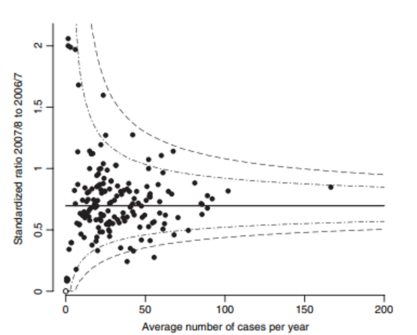
Out of 168 trusts, 16 (10%) lie outside the central 95% region, compared with 8.4 that would be expected by chance alone, and three lie outside the central 99.8% region.
How is a funnel plot interpreted?
Funnel plots discourage inappropriate ranking because they take into consideration the service volume or denominator upon which an indicator result is calculated. Typically, lower numerator/denominator indicators create results that are subject to more variation than those created by larger numerator/denominator indicators. However, they provide a strong visual indication of indicator results that are statistically higher or lower than the national average despite service volumes.
Under the null hypothesis that an organization (hospital) exactly meets the standard, z-value has mean 0 and SD 1, and if normality is assumed then:
- the outside funnel represents P-value 0.001 (which correspond to `z_(crit)` = ± 3.10, approximately `3sigma` from the average) equal to a 99.7% confidence limit, and
- the inside funnel represents P-value 0.025 (which is correspond to `z_(crit)` = ± 1.96, approximately `2sigma` from the average) equal to a 95% confidence limit.
Indicator values outside of the funnel indicate out-of-the-ordinary results after the size of a hospital or a health region has been taken into account. Health regions or hospitals with indicator values inside the funnel have results within an expected variation, given their size. To interpret indicator results as they relate to the funnel, the directionality of the indicator must be considered.
- When lower values for the indicator are desirable (e.g., mortality rates), hospitals or health regions with rates lying above the upper 95% control limits (funnel) can be considered to be in the
warning
zone, while those above the upper 99.8% control limits (funnel) are in theconcern
zone. Such results may warrant further investigation. - When higher values for the indicator are desirable (e.g., rates of hip fracture repair within 48 hours), hospitals or health regions with rates lying below the lower 95% control limits (funnel) are in the
warning
zone, while those below the lower 99.8% control limits (funnel) are in theconcern
zone.
P-chart example from the literature
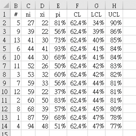
- Data from reference 4 (table 5.9), shown in table 2 above, after renaming the columns as follows:
hospitals
as sequential numbers#
,number of S. aureus infections
as the denominator`n_i`
, and thenumber of MRSA
as the count`x_i`
in each group. Table 2 shows the data arranged in order of subgroup size `n_i`, from smallest to largest. - The indicator value for each group `p_i = x_i` ÷ `n_i` is calculated as
=D2/C2
for cell E2 and the formula copied downwards to fill column E. -
The grand mean of all groups was calculated as `bar (bar p)` "=SUM(D2:D14)/SUM(C2:C14)" = 0.62448.
This was stored in column F, which was labelled
CL
, the center-line of the control graph. -
Column G was labelled
LCL
(lower-control limit), and calculated by the limit formula for p-charts:
for cell G2: "=F2-3*SQRT(F2*(1-F2)/C2)" = 0.3490 = 34.5%
In the same way, column H was labelledUCL
(upper-control limit), and calculated by the limit formula for p-charts:
for cell H2: "=F2+3*SQRT(F2*(1-F2)/C2)" = 0.90406 = 90.4% - Figure 2 shows the funnel chart drawn using table 2 data.
![Figure 2. Example of Funnel plot from the literature <sup> [2] </sup> : p-chart of percentage of MRSA with funnel limits.](https://unaettie.com/img/funnel_provost171_graph.png)
Result:
•
There are 3 organizations outside the limits, 2 above (4th, 10th) and one below (9th).
•
It is clear that special cause in MRSA rates is not occurring only in organizations with a large number of cases of Staphylococcus aureus.
U-chart example from regional hospital
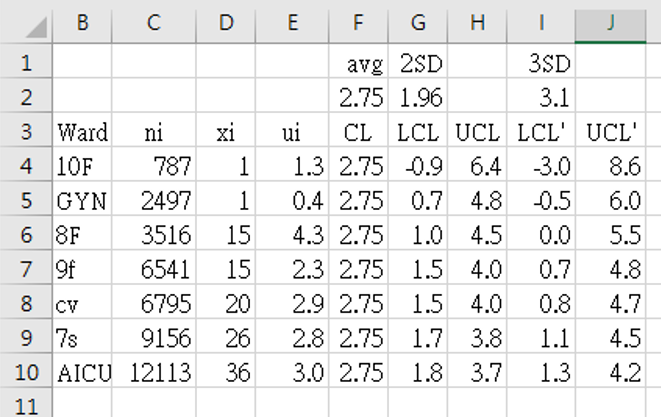
- Data collection period: from January 1 2019 to April 30 2021.
- Data from table 3 above, columns as follows:
Ward
instead of sequential numbers#
, total number of days using indwelling-urinary catheter in patients in that ward as the denominator`n_i`
, and the total number of urinary tract infections diagnosed according to CDC criteria as the count`x_i`
in each group. Table 3 shows the data arranged in order of subgroup size (`n_i`), from smallest to largest. - The indicator value for each group `u_i = x_i` ÷ `n_i` is calculated as
=1000*D4/C4
for cell E4 (to show CAUTI infection rate as ‰) and the formula copied downwards to fill column E. -
The grand mean of all groups was calculated as `bar (bar u)` "=1000*SUM(D4:D10)/SUM(C4:C10)" = 2.75329.
This was stored in column F, which was labelled
CL
, the center-line of the control graph. -
Columns G (LCL) and I (LCL') (lower-control limit) were calculated by the limit formula for u-charts using `z_(crit)` values 1.96 [G2] and 3.1 [I2]:
G4: "=$F$2-$G$2*SQRT($F$2*1000/C4)" = -0.912728 = -0.9‰
I4: "=$F$2-$I$2*SQRT($F$2*1000/C4)" = -3.045005 = -3.0‰ -
In the same way, columns H (UCL) and J (UCL') (upper-control limit) were calculated by the limit formula for u-charts using `z_(crit)` values 1.96 [G2] and 3.1 [I2]:
H4: "=$F$2+$G$2*SQRT($F$2*1000/C4)" = 6.41931 = 6.4‰
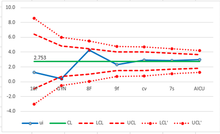
J4: "=$F$2+$I$2*SQRT($F$2*1000/C4)" = 8.55159 = 8.6‰ - Figure 3 shows the funnel chart drawn using table 3 data.
Result:
•
The overall CAUTI rate for the whold hospital (CL) is 2.753‰.
•
All wards are within the control limits (#GYN is just on the 2SD LCL).
•
There is no special cause shown in this graph, regardless of wheter days of Foley catheter usage were high (ward 7s) or low (ward 10f).
•
Attempts to improve should be targeted at the hospital-wide system for managing CAUTI and not at any particular ward.
P-chart example from regional hospitals matched against group standard
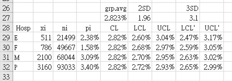
- Data collection period: from January 1 2017 to April 30 2021.
- Data from table 4 above, columns as follows:
Hospital
instead of sequential numbers#
, total number of inpatients during that period for each hospital as the denominator`n_i`
, and the total number of deaths in each group`x_i`
. Table 4 shows the data arranged in order of subgroup size (`n_i`), from smallest to largest. - The indicator value for each group `p_i = x_i` ÷ `n_i` is calculated as
=B29/C29
for cell D29 (to show mortality rate as %) and the formula copied downwards to fill column D. -
The grand mean of all groups was calculated as
`bar (bar p)` "=SUM(B29:B32)/SUM(C29:C32)" = 2.82334%.
This was stored in cell $E$27, and copied from E29 to E32 asCL
, the center-line of the control graph. -
Columns F (LCL) and H (LCL') (lower-control limit) were calculated by the limit formula for p-charts using `z_(crit)` values 1.96 [F27] and 3.1 [H27]:
F29: "=$E$27-$F$27*SQRT(($E$27*(1-$E$27))/C29)" = 2.60192% = 2.60%
H29: "=$E$27-$H$27*SQRT(($E$27*(1-$E$27))/C29)" = 2.47314% = 2.47% -
In the same way, columns G (UCL) and I (UCL') (upper-control limit) were calculated by the limit formula for p-charts using `z_(crit)` values 1.96 [F27] and 3.1 [H27]:
G29: "=$E$27+$F$27*SQRT(($E$27*(1-$E$27))/C29)" = 3.04475% = 3.04%
I29: "=$E$27+$H$27*SQRT(($E$27*(1-$E$27))/C29)" = 3.17353% = 3.17% - Figure 4 shows the funnel chart drawn using table 4 data.
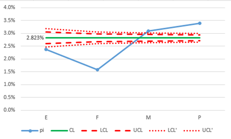
Result:
•
The weighted average mortality rate for these 4 hospitals (CL) is 2.823%. This indicator is interpreted as the lower the better.
•
All 4 hospitals special cause variation; 2 hospitals (E, F) below the outer funnel (99.7%) and 2 hospitals (M, P) above the outer funnel (99.7%).
•
The two hospitals (M, P) above the outer funnel (UCL') should be targeted for investigation as to what can be done to improve results.
•
The two hospitals (E, F) below the outer funnel (LCL') should consider data validation to ensure that their reports are not under-estimating the mortality rate.
•
The small number of hospitals in this graph may be cause for the extreme variation in relation to control limits. Results would be more convincing if more hospitals participated in the analysis.
P-chart example from regional hospitals matched against national standard
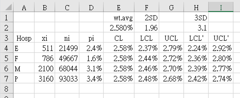
- Data collection period: from January 1 2017 to April 30 2021.
- Data from table 5 above, columns as follows:
Hospital
instead of sequential numbers#
, total number of inpatients during that period for each hospital as the denominator`n_i`
, and the total number of deaths in each group`x_i`
. Table 5 shows the data arranged in order of subgroup size (`n_i`), from smallest to largest. - The indicator value for each group `p_i = x_i` ÷ `n_i` is calculated as
=B4/C4
for cell D4 (to show mortality rate as %) and the formula copied downwards to fill column D. -
The grand mean of all groups was calculated as
`bar (bar p)` = 2.580%
This was stored in cell $E$2, and copied from cell E4 to E7 asCL
, the center-line of the control graph. -
Columns F (LCL) and H (LCL') (lower-control limit) were calculated by the limit formula for p-charts using `z_(crit)` values 1.96 [F2] and 3.1 [H2]:
F4: "=$E$2-$F$2*SQRT(($E$2*(1-$E$2))/C4)" = 2.36808% = 2.37%
H4: "=$E$2-$H$2*SQRT(($E$2*(1-$E$2))/C4)" = 2.36808% = 2.37% -
In the same way, columns G (UCL) and I (UCL') (upper-control limit) were calculated by the limit formula for p-charts using `z_(crit)` values 1.96 [F2] and 3.1 [H2]:
G4: "=$E$2+$F$2*SQRT(($E$2*(1-$E$2))/C4)" = 2.79192% = 2.79%
I4: "=$E$2+$H$2*SQRT(($E$2*(1-$E$2))/C4)" = 2.91519% = 2.92% - Figure 5 shows the funnel chart drawn using table 5 data.
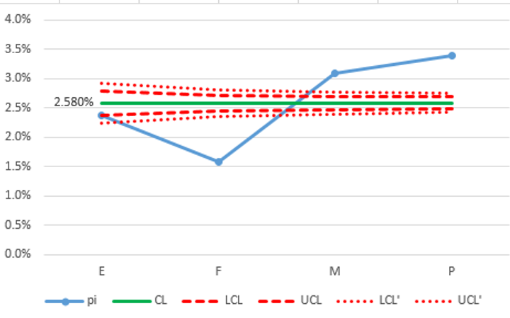
Result:
•
Funnel charts are usually compared to a national standard (if such data is available). The weighted average mortality rate (CL) from the national database for medical centers was 2.580%.
•
Although this funnel chart still uses only the 4 regional hospitals from figure 4, in this case (using the national standard) we do not have to worry about the number of participating hospitals being too small. Calculations only use the national average and each hospital's denominator so the results are independent of how many other hospitals are, or are not, participating.
•
As in the previous example, hospitals that are outside the lower limit need first to check their data and rule out under-reporting.If the data has been validated, then hospital E can relax that they have achieved a result equivalent to, or even slightly better than, the national standard. If data has been validated, then hospital F is better than the national average. Before being over-confident, they need to look at other factors (such as regional demographics, and risk stratification) that may explain the differences.
•
Compared to Figure 4, both hospitals M and P are even more clearly outliers above the 99.7% upper control limit (UCL'). They should target their quality improvement program to this indicator to see why their mortality rates are higher than the national average.
References
- Canadian Institute for Health Information. Use of Funnel Plots for Reporting Indicator Results www.cihi.ca
- Provost LP, Murray SK. The health care data guide. Learning from data for improvement. www.amazon.com 2011. John Wiley & Sons.
-
Spiegelhalter DJ.
Funnel plots for comparing institutional performance.
Statistics in Medicine
2005; 30;24(8): 1185-1202.
DOI: 10.1002/sim.1970 2004-11-29. - Spiegelhalter DJ, Sherlaw-Johnson C, Bardsley M, Blunt I, Wood C, Grigg O. Statistical methods for healthcare regulation: rating, screening and surveillance. J. R. Statist. Soc. A 2012; 175, Part 1, pp. 1–47