If rate > 0.10 (number-between < 10), use rate-based control charts
• 3 SSI's in 20 patients = 0.15
If rate < 0.10 (number-between > 100), use number-between control charts
• 1 complication in 200 days = 0.005
• 1 needle stick in 100 days = 0.01
If 0.01 < rate < 0.10, use either/both control charts
If a "rare" event is roughly defined as something that occurs with a frequency of less than 10%, then there are many examples in healthcare including medication errors, patient falls, nosocomial infections, surgical complications and VAP. If non-rare event, rate-based, control charts are used to monitor these adverse events, they have the following problems:
- The majority of points is equal to zero
- It is not clear, just by looking, what it means (is it acceptable or not)?
- Statistically not useful
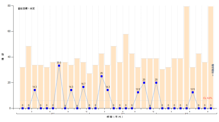
- Two type of situations can occur (Figure 1):
- Periodic rare events: "mountain range" appearance where the zeros are the valleys
- Prolonged periods with no events. Which raises the quesion: How long before we can say with confidence that the process has shown significant improvement?
Often compliance with a related process is used to indirectly assess a clinical outcome. Some examples:
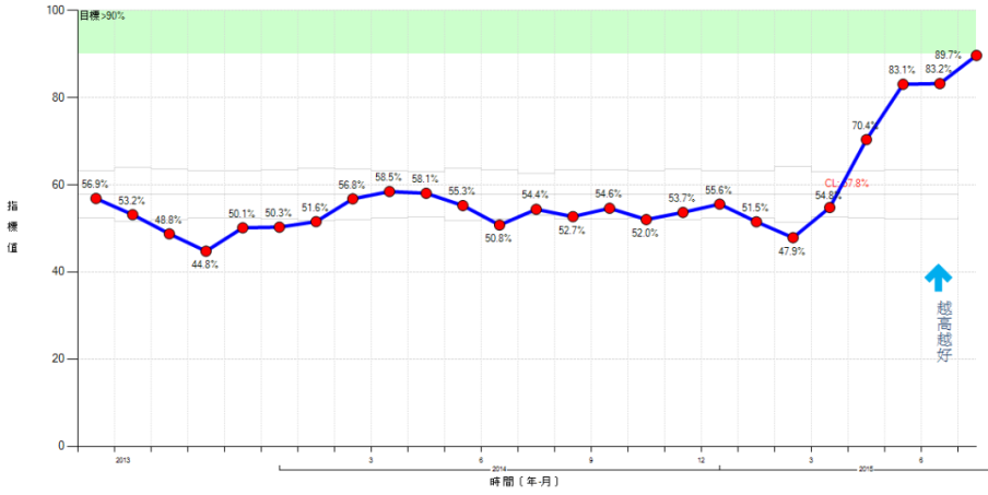
- Antibiotic timing for surgical prophylaxis, which is assumed to correlate with the SSI rate (Figure 2).
- Compliance with WHO Surgical Safety Checklist, compared to perioperative adverse events (POAE).
Solutions are based on measuring the event interval:
- Number of cases between events (g chart): for example, the number of surgical operations between surgical site infections
- Number of open heart surgeries between sternal wound infections.
- Number of CABG procedures between adverse events.
- Time between (interval) events (T-chart): This is used because it is not always practical to measure the exact number between events. Some examples:
- Days between needle sticks.
- Number of inpatient days between patient falls.
This data is relatively easy to collect: you only need to record the dates that events occurred. However, evaluating the interval control needs a change in thinking.
Identifying process changes.
- A higher value on the chart means that the rate of the event occurring has actually decreased because the time between events is longer (Figure 3). For adverse events this is a good thing. Similarly, a smaller value plotted on the chart means that the rate of the event occurring has increased.
- Runs above or below baseline median
- 3 ~ 5 points = Possible improvement
- 5 ~ 6 points = Probable improvement
- 8 or more points = Near-certain improvement
- Simple rule {3:x-bar rule}:
- Time-between:
- Plot the time or number between events. Compute baseline average time-between (can be overall, which is more conservative, or before changes).
- Check if the plotted datapoint > 3 times the average? If so, improvement (reduction in rate) at approximately 0.05 significance level (Figure 2, last two points on the right). Alternatively use 4 x baseline for approximately 0.02 significance (Figure 2, last point on right).
- Number of consecutive months with zero cases.
- Plot the number of cases per month. Calculate the monthly baseline average.
- Divide 3 by the monthly baseline average. Is the number of consecutive months with zero > 3 times the average? If so, improvement (reduction in rate) at approximately 0.05 significance level.
- The lower the rate (rare event), the longer the period of consecutive zeros required to confirm improvement (Table 1). For example, if an event occurs each month (12/year), thens 3 consecutive months of zeros are required, whereas a rate of 1 event per year would need 3 years of zeros for confirmation.
- Time-between:


Table 1. Number of zeros required to confirm improvement
Events = number of events per year
CL = Events/month
Zeros = number of months of consecutive zeros required for confirmation
| Events | CL | 3/CL | Zeros |
|---|---|---|---|
| 1 | 0.08 | 36.0 | 36 |
| 3 | 0.25 | 12.0 | 12 |
| 6 | 0.50 | 6.0 | 6 |
| 12 | 3.00 | 3.0 | 3 |
| 15 | 1.25 | 2.4 | 3 |
| 18 | 1.50 | 2.0 | 2 |
| 21 | 7.75 | 1.7 | 2 |
| 24 | 2.00 | 1.5 | 2 |