- σz ≅ 1 indicates that no adjustment is necessary and that the Laney attributes chart is exactly the same as a traditional attributes chart.
- σz will be >1.0 if there is over-dispersion, and <1.0 if there is under-dispersion.
- σi calculates the sampling variation (within subgroups) of p and u attribute charts.
- σz calculates the relative amount of process variation (between subgroups) not explained by the binomial (p chart) or poisson (u chart) assumption alone. [1]
Attribute charts are often used to monitor data that are counts. This includes yes/no type data — (such as whether the patient's weight is within a specified range) and counting-type data (such as the number of satisfaction surveys returned). These attribute charts are based on assumptions about the which underlying distribution (either binomial or poisson) and the assumption that the average of the distribution is the same over time. These assumptions are often not true, particularly with large sample sizes.
Using the calculations for Shewhart charts for attribute data (p, u) with very large subgroup sizes can result in charts that are not very useful (Table 1, Figure 1). The plotted data points have much more variation than that expected from the theoretical calculation of limits based on the Binomial (p chart) or Poisson (u chart) distribution. The problem has been called over-dispersion
in health care applications [5] . This phenomenon can occur quite often when using measures from administrative databases to develop the charts.
If a p or u control chart has control limits so narrow that almost every point is beyond the control limits, use a Laney P' chart (P' is pronounced as P prime
) or U' chart (U prime
) to adjust for overdispersion or underdispersion in your data. Overdispersion can cause a traditional attribute chart to show an increased number of points outside the control limits. Underdispersion can cause a traditional attribute chart to show too few points outside of the control limits. The Laney P' chart adjusts for these conditions.
How to investigate an over-dispersion control chart
- First develop the appropriate attribute chart (p or u)
- If the limits appear
too narrow (tight)
and very large subgroups are involved, look for ways to stratify the data, for example:- monthly into daily subgroups
- organization data into department subgroups
- If you still end up with large subgroup sizes and a chart that is full of special causes, spend time with the subject matter expert trying to identify and understand the special causes.
Example of a traditional p chart (binomial distribution)
Table 1 shows data are from a call center of a health care organization [4] . The table gives the number of patients who communicated with the health care center by phone each month (`x_i`), and the total number of patients registered for that health care organization for that month (`n_i`). Each month (subgroup) is represented by a consecutive index number shown as the subscript (`i`) for associated parameters. The count starts from 1, to a total (`k`) of 16 subgroups.
`x_i =` number of occurrences of the attribute of interest
- Calculate the percentage of members who communicated by phone each month.
Copy this formula for all column D:
`p_i = ((x_i/n_i) times mf)` where`mf`
= multiplication factor
for example: [D3] "=(B3/C3)*1" ←`mf`=1 (ignore the quotation marks when entering the formula) - Calculate the average call in rate of members (`bar p`) who communicated by phone each month (store in cell M1 for example):
`bar p = frac {sum_(i=1)^k(p_i)}{k}`
[M1] "=SUM(D3:D18)/`k`" - Calculate the standard deviation according to the binomial distribution.
Copy this formula for all of column E:
`sigma_p = sqrt(frac{bar p ((1 times mf) - bar p)}{n_i})` where`mf`
= multiplication factor
for example: [E3] "=SQRT($M$1*((1 * `mf`)-$M$1)/C3)" - Fill column F with the average call rate `bar p`, labelled CL (center-line on graph)
`0.4774` - Calculate the lower control limit (LCL) for each month (varies because `n_i` varies).
Copy this formula for all of column G:
`LCL = bar p - 3 sigma_p`
for example: [E3] "=F3-3*E3" - Calculate the upper control limit (UCL) for each month (varies because `n_i` varies).
Copy this formula for all of column H:
`UCL = bar p + 3 sigma_p`
for example: [E3] "=F3+3*E3" - Graph columns D (`p_i`), F (CL), G (LCL), H (UCL) as line graphs.
See Figure 1.

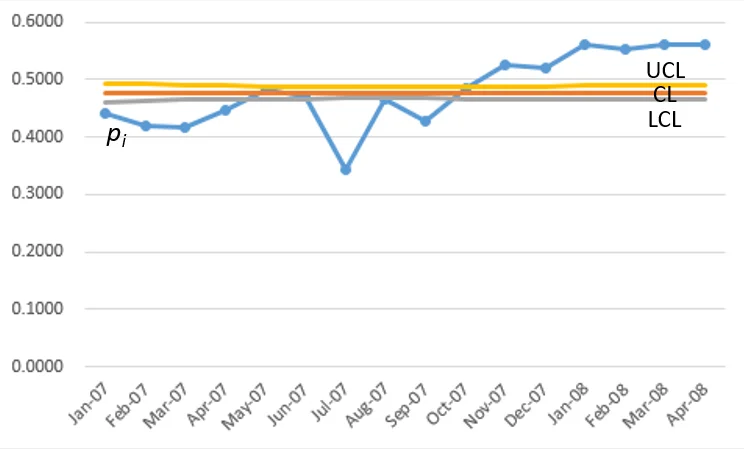
- Control limits (LCL, UCL) are very narrow, clumped together near the center line (CL)
- Nearly all data points are outside the control limits
out-of-controlsystem, or rather, a situation that this graph does not assist in interpreting.
Modification:
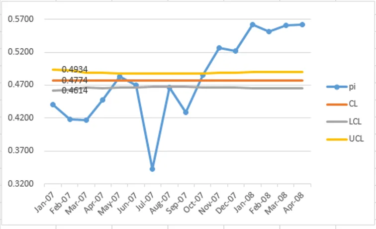
Even if we adjust the scale of the y-axis from 0.32 to 0.58 (Figure 1a) to focus on the area between the control limits, the result is the same: such narrow control limits result in most data points being outside the limits.
(Beware!) using a non-zero starting point for the y-axis is not appropriate for quality improvement data since it creates the potential for misinterpretation. As in this example, the gap between LCL and UCL looks relevant
when the y-axis is restricted to just a little more than the control limits (Figure 1a: 0.32 ~ 0.58), but in viewing the data correctly with the y-axis starting from zero (Figure 1), the traditional
control limits are very narrow and are not helpful in interpreting performance in the system being studied.
Interpretation:
A control chart compares the within subgroup variation with the between subgroup variation. This example (Figure 1) shows that the within month variation is much less than the between month variation.
One reason this occurs is the large subgroup size. Note that the `n_i` value is in the denominator of the control limits. Therefore, the control limits (LCL, UCL) get closer together as `n_i` gets larger; that is why so many points are beyond the control limits.
What about using individuals control chart instead?
In the past, this problem was managed by treating the data as individual values and using an individuals chart (`XmR` chart, using the `X` chart only, not the moving range `mR` chart) to analyze the data. This approach does not account for varying subgroup sizes. The Laney `p^'` chart takes care of this problem.
How to calculate Laney `p^'` control chart
The purpose of moving range calculations is to quantify the amount of routine variation in a performance measure. Knowing how much routine variation there is helps you filter the noise and more easily see the non-routine or exceptional variation. A moving range is simply a series of calculations where you take the difference between successive values in a performance measure. When you get a negative value, just ignore the negative sign (the minus sign) — you just want to know the size of the difference between the successive values, not the direction of the difference. You will have one less moving range value than you have performance measure values.
If you are not able to learn from the special causes, then use the following method to develop a modified attribute chart (for example, p chart):
Data tables shown on this page are formatted for convenience in presentation, but calculations in Excel should not be truncated to any set number of decimal points. Let the computer calculate to the accuracy that its design allows!
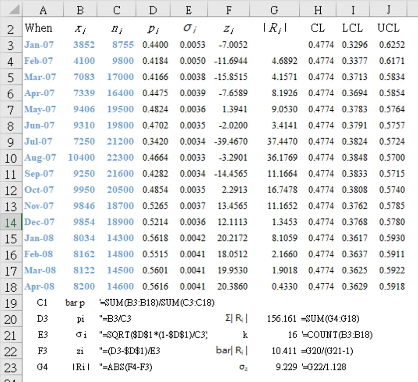
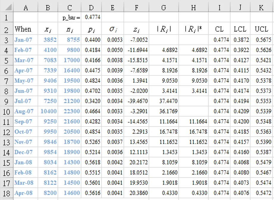
- Calculate the p chart in the same way as for traditional p chart (getting `p_i` and `sigma_p` for each subgroup: see Table 2, columns D and E) `CL = bar p = frac {Sigma(p_i)}{k}` (center line)
`sigma_(p_i) = sqrt(frac{bar p ((1 times mf) - bar p)}{n_i})` where`mf`
= multiplication factor - Convert the individual p values to z values (column F) [a `z` value tells you the number of sample standard deviations between the point and the average] using: `z_i = frac {p_i - bar p}{sigma_(p_i))`
[F3] "=(D3-$D$1)/E3" (`z_1` = -7.0052) - Calculate the moving ranges of `z` (column G) between consecutive points: |`R_i`|` = | z_i - z_(i-1) | (i = 2, ..., k)`
[G4] "=ABS(F4-F3)" (|`R_2`| = 4.6892 ) - Use screened list of moving ranges to calculate the average moving range. `bar R^' = frac{1}{k - 1} sum_(i=2)^k(R_i^')` = 10.411
[G22] "=SUM(G4:G18)/(COUNT(B3:B18)-1)" - Screen for special causes and remove from list of moving ranges.
- Calculate the sigma for z values (1.128 is a constant that depends on the moving range size (where in this case the number of data involved in each moving range calculation equals 2): `sigma_z = frac{bar R^'}{1.128}` = 9.229
[G23] "=G22/1.128" - Calculate the limits for the p' chart `CL = bar p` (same as original p chart) = 0.4774
`LCL = bar p - 3 sigma_(p_i) sigma_z`
`UCL = bar p + 3 sigma_(p_i) sigma_z`
[I3] "=H3-3*E3*$G$23" (`LCL_1=0.3296`)
[J3] "=H3+3*E3*$G$23" (`UCL_1=0.6252`)
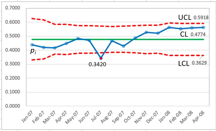
Compare the control limit equations for the `p` control chart and the Laney `p^'` control chart. The only difference is the term `sigma_z` in the Laney `p^'` control chart. The data now shows that only point 7 is outside the control limits.
`sigma_z = 9.229 ` (>1.0) indicates over-dispersion!
Laney description of `sigma_z` [7]
It is the relative amount of process variation not explained by the binomial assumption alone. As `n_i` increases, the variation due to sampling diminishes, thus making the batch-to-batch component relatively larger. That is why applications with large subgroups reveal this situation very often.
How to calculate Laney p' control chart
by removing extreme items from the moving range
Same procedure as above (Table 2, Figure 2), but with the addition of Step 5 (Screen for special causes and remove from list of moving ranges) as in Provost (p156-7) [4] .
Calculate the Upper Limit of the Moving Range Limit [ULMR] (for moving ranges in `XmR` charts) [6]
There is no lower limit for the `mR` chart because the moving ranges have a logical minimum of zero. The Upper Range Limit [ULMR] is the Average Moving Range `bar R^'` multiplied by 3.27. This value of 3.27 is always the value you will use.
It is a statistically derived constant that makes the Upper Range Limit [ULMR] roughly equivalent to 3 standard deviations from the Average Moving Range `bar R^'`. In other words, it makes sure that the Upper Range Limit [ULMR] accurately describes the routine variation in the moving range values.
Column G22: average moving range `bar R^' = 10.411`
- Screen for special causes and remove from list of moving ranges as follows:
- Calculate the cut-off value ULMR `= 3.27 times bar R^' = 34.0432`
- Remove any moving range bigger than ULMR; that is, the following two:
` i=7, | R_7 | = 37.4470`
` i=8, | R_8 | = 36.1769` - Recalculate the average moving range `bar R^'`
`sum_(i=2)^k | R_i | ` = SUM(H3:H18) = 82.537
`k^' ` = COUNTIF(H3:H18,">0") = 13
`bar R^' = frac{sum_(i=2)^k | R_i | }{k^'} = 82.537/13 = 6.349`
(this recalculation should be done only once)
- Calculate the sigma for z values `sigma_z = frac{bar R^'}{1.128} = 6.349/1.128 = 5.629``sigma_z = 5.629 ` (>1.0) indicates over-dispersion!
- Calculate the limits for the p' chart `CL = bar p` (same as original p chart)
`LCL = bar p - 3 sigma_(p_i) sigma_z`
`UCL = bar p + 3 sigma_(p_i) sigma_z`
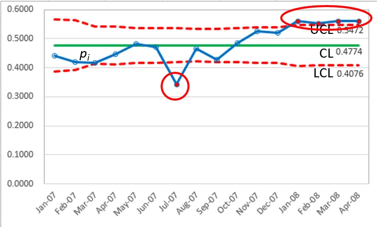
`p_7 = 0.3420 ` (below LCL)
`p_13 ~ p_16 ` (above UCL)
Note that the final four points in the series would have been interpreted as
in control(Figure 2) if the moving range correction was not applied.
`sigma_z = 5.629 ` (>1.0) indicates over-dispersion!
Traditional calculations for attribute `u` chart
Example scenario (Table 4, Figure 4): [8]
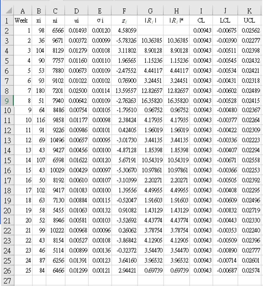
A hospital group is monitoring the error rate for medicines given to patients. The group involves several hospitals. The daa recorded each week is the number of patients given medicine (`n_i`) and the number of errors (`x_i`). The errors can include giving the wrong dosage, not giving the medicine, etc. The data for 25 weeks are shown in Table 4.
Do not round the data in Excel; calculate the percentages as ui = xi ÷ ni for each value and leave the number of decimal points for Excel to decide its accuracy!
- Calculate the overall average error rate, and store in any empty cell (for example, [M1]): `bar u = ({sum_(i=1)^k x_i}/{sum_(i=1)^k n_i} times mf )` where
`mf`
= multiplication factor
[M1] "=(SUM(B2:B26)/SUM(C2:C26))`times`1" = 0.00943 - Calculate the weekly error rate, and fill column D with the results: `u_i = x_i / n_i`
[D2] "=B2/C2" = 98/6566 = 0.01493 - Calculate the weekly standard deviation for traditional `u` chart, and fill column E with the results: `sigma_(u_i) = sqrt(frac{bar u}{n_i})`
[E2] "=SQRT($M$1/C2)" = SQRT(0.00943/6566) = 0.00120 - Fill column F with `bar u` (CL): [F2~F26] "= $M$1" = 0.00943
- Fill column G with traditional lower control limit for `u` chart (LCL), varied for each row: `LCL_(u_i) = bar u - 3 times sigma_(u_i)`
[G2] "=$M$1-3*E2" = 0.00584 - Fill column H with traditional upper control limit for `u` chart (UCL), varied for each row: `UCL_(u_i) = bar u + 3 times sigma_(u_i)`
[H2] "=$M$1+3*E2" = 0.01303 - Use columns I and J to check if points are outside control limits: [I2] "=IF(D2<G2,"Y","")"
[J2] "=IF(D2>H2,"Y","")"
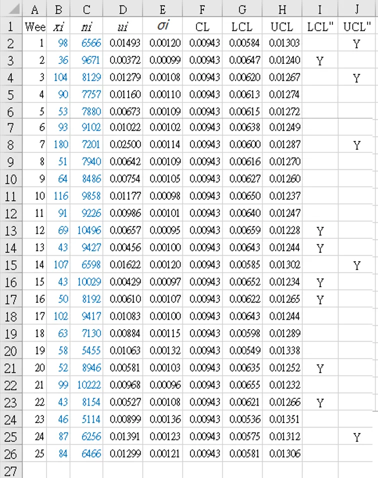
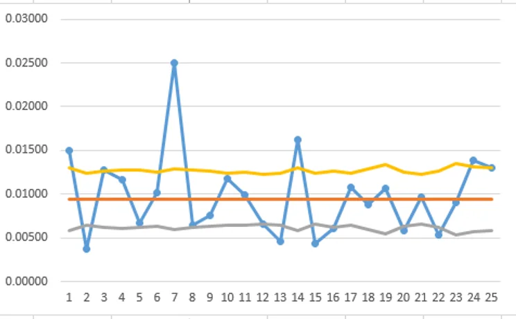
Using columns J and K to check if points are outside control limits:
Weeks below LCL: 2, 12, 13, 15, 16, 20, 22
Weeks above UCL: 1, 3, 7, 14, 24
Laney calculations for `u^'` chart
The `z` value for point `i` is calculated as:
- Make a copy of Table 4 and insert columns F(`z_i`), G (|`R_i`|), and H ( |`R_i`|*). This becomes Table 5. (Table 4 columns F,G,H now become I,J,K in Table 5)
- Using the same steps as for Laney p' chart, confirm the following calculations:
`bar u ` [P1]: "=SUM(B2:B26)/SUM(C2:C26)" → `0.00943`
`bar R` [P2]: "=AVERAGE(G3:G26)" → `5.07597` - Screen for special causes and remove from list of moving ranges.
ULMR [P3]: "=3.27*$P$2" → `16.59844`
No values in column G (`R_i`) exceed ULMR, so column H (`R_i`*) is a repeat, and does not affect the next step. - Calculate the z-value sigma for this data:
`sigma_z` [P4]: "=$P$2 ÷ 1.128" → `5.07597/1.128 = 4.49997`
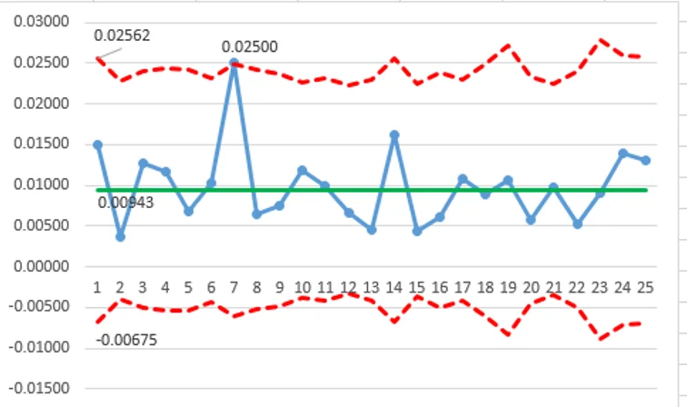
Only one point (`u_7=0.02500`) is outside the control limits (>UCL).
`sigma_z = 4.49997 ` (>1.0) indicates over-dispersion!
NOTE: this graph with LCL values below zero is displayed for demonstration purposes only (to show the result of all calculations). Control limits can not be below zero, and in a production version of this graph, the LCL values below zero should all be adjusted to zero!
Other examples in the literature
For those of you who are familiar with the R language, Jacob Anhøj [9] has a very detailed explanation of quality improvement charts. This qicharts2 package contains two main functions for analysis and visualisation of data for continuous quality improvement: qic() and paretochart(). The last example graph (Case 5) uses nhs_accidents dataset to demonstrate the use of p prime charts. The nhs_accidents dataset contains the number of emergency patients seen within 4 hours of attendance. The sample sizes are very large (> 250,000).
Laney notes that when over-dispersion is not present, prime charts will give the same results as traditional charts, and Laney recommends always to use prime charts for proportions and rates.
![Figure 6. Proportion of patients seen within 4 hours of attendance (Laney p' chart). <sup> [9] </sup>](https://unaettie.com/img/anhoj_case5.webp)
References
- Laney DB. A New Control Chart: Laney P’ Chart YouTube Pyzdek Institute, 2019 May 2.
- Laney DB. Improved Control Charts for Attributes Quality Engineering 2002; 14(4): 531-537.
- Mohammed MA, Laney DB. Overdispersion in health care performance data: Laney's approach Qual Saf Health Care 2006; 15(5): 383-4.
- Provost LP, Murray SK. The health care data guide. Learning from data for improvement. www.amazon.com 2011. John Wiley & Sons.
- Minitab 18 Support. Overdispersion and underdispersion. support.minitab.com/.../overdispersion-and-underdispersion [Accessed 2021-07-12]
- Barr S. Chapter 10. XmR Chart Instructions www.staceybarr.com [Accessed 2021-07-14]
- McNeese B. Laney p' Control Chart www.spcforexcel.com/.../laney-p-control-chart [Accessed 2021-07-12]
- McNeese B. Laney u' Control Chart www.spcforexcel.com/.../laney-u-control-chart [Accessed 2021-07-12]
- Anhøj J. Quality Improvement Charts. An implementation of statistical process control charts for R anhoej.github.io/.../qicharts2.html [Accessed 2021-07-12]