Using run charts for quality improvement
A good way to monitor the impact of changes during a quality improvement project is to create a run chart, starting with an initial median using baseline data. If the baseline data comes from a process showing no signals (shift, trend, runs, astronomical data points), extend or 'freeze' this initial median into the future. In this way, new data are not allowed to influence the initial median. Any changes in the new data stand out against the baseline median more clearly, allowing for more accurate detection of signals of improvement (the probability-based rules are relative to this median value).
The shift and run rules require more than 10 points before they are applicable. But there are many applications (e.g. patient monitoring of annual PSA tests) where the run chart is useful with just three or four data points in order to get an early indication of central tendency and trend.
Limitations
Run charts are designed for the early detection of signals of improvement or degradation in a process over time.
However, run charts are not capable of determing if a process is stable (as defined by Shewhart in relation to control charts only). Using control chart language with run charts can create confusion because the two methods include different rules for identifying non-random patterns. When using run charts, avoid the terms "special cause" and "stable" or "unstable", reserving the use for control charts.
How to construct a run chart
- A run chart is a graphical display of data plotted in some type of order.
- The horizontal axis is most often a time scale (e.g. days, weeks) but could also include sequential patients, vists or procedures.
- The vertical axis represents the quality indicator being studied (e.g. infection rate, number of patient falls, readmission rate).
- Usually, the median is calculated and used as the chart's centerline.The median is used as the centerline because:
- it provides the point at which half the observations are expected to be above and
- the median is not influenced by extreme values in the data.
- Goal lines and annotations of changes and other events can also be added to the run chart.
Goal lines and annotations of changes and other events can also be added to the run chart.
Rules to help interpret a run chart
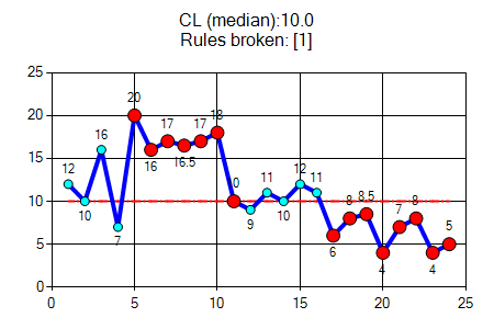
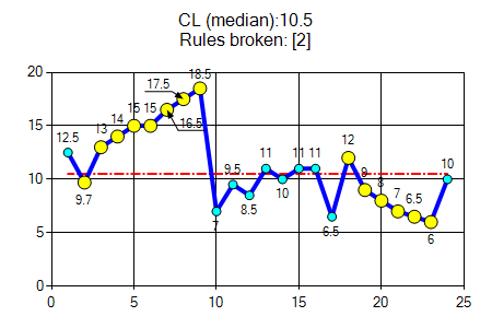
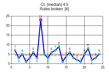
The three probability-based rules are used to objectively analyse a run chart for evidence of non-random patterns in the data based on an α error of p<0.05.
|
six or more consecutive points either all above or all below the median. Values that fall on the median do not add to not break a shift. Skip all values that fall on the median and continue counting. |
|

|
Five or more consecutive points all going up or all going down.If the value of two or more consecutive points is the same, only count the first point and ignore the repeating values; like values do not make or break a trend. |
|

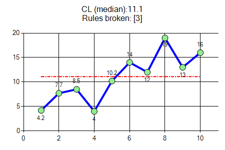
A run is a series of points in a row on one side of the median. A non-random pattern is signalled by too few or too many runs, or crossings of the median line.
- Count the number of times the line connecting the data points crosses the median and add one.
- For example, in graph #3 "Rules broken [3]", the blue data line consists of 10 data points, and this data line crosses the median just once (between point 5 and point 6).
- Add one and the "number of crossings" to test is "1+1=2".
- Compare with Table-1 at the bottom of this page to determine if too many or too few runs exist. Table 1 shows the number of crossings that would be expected if the data was randomly distributed; the number is shown as a range from "lower limit (LL)" to "upper limit (UL)".
- For n = 10, the lower limit is 3 and the upper limit is 9; that is, for this data series to pass the test for random results, the number of crossings should be between LL and UL (3~9).
- However, n=2 (outside the range 3~9), so the conclusion is that the data is not randomly distributed.
- For our quality improvement monitoring, this indicates a change that may be a result of actions.

A run is a series of points in a row on one side of the median.
It is used when deciding whether data is randomly distributed.
An astronomical data point is one that is obviously different from the rest of the points. Astronomical points should not be confused with the highest or lowest data points, which every run chart will have. While Rules 1, 2 and 3 are probability based, Rule 4 is subjective and recognises the importance of the visual display of the data in a run chart.

References
- Provost LP, Murray SK. The health care data guide. Learning from data for improvement. www.amazon.com 2011. John Wiley & Sons.
- Perla RJ, Provost LP, Murray SK. The run chart: a simple analytical tool for learning from variation in healthcare processes. wwwncbi.nlm.nih.gov BMJ Qual Saf 2011; 20: 46-51.
- Hart MK, Hart RF. Statistical process control for health care. 2000 www.amazon.com
Appendix
• NN = Total number of data points on the run chart that do not fall on the median
• LL = Lower limit for the number of runs (< than this number runs is 'too few')
• UL = Upper limit for the number of runs (> than this number of runs is 'too many')
| NN | LL | UL | NN | LL | UL | NN | LL | UL | NN | LL | UL | NN | LL | UL | NN | LL | UL |
|---|---|---|---|---|---|---|---|---|---|---|---|---|---|---|---|---|---|
| 10 | 3 | 9 | 20 | 6 | 16 | 30 | 11 | 21 | 40 | 15 | 27 | 50 | 19 | 33 | 60 | 24 | 38 |
| 11 | 3 | 10 | 21 | 7 | 16 | 31 | 11 | 22 | 41 | 15 | 27 | 51 | 20 | 33 | |||
| 12 | 3 | 11 | 22 | 7 | 17 | 32 | 11 | 23 | 42 | 16 | 28 | 52 | 20 | 34 | |||
| 13 | 4 | 11 | 23 | 7 | 17 | 33 | 12 | 23 | 43 | 16 | 28 | 53 | 21 | 34 | |||
| 14 | 4 | 12 | 24 | 8 | 18 | 34 | 12 | 24 | 44 | 17 | 29 | 54 | 21 | 35 | |||
| 15 | 5 | 12 | 25 | 8 | 18 | 35 | 12 | 24 | 45 | 17 | 30 | 55 | 22 | 35 | |||
| 16 | 5 | 13 | 26 | 9 | 19 | 36 | 13 | 25 | 46 | 17 | 31 | 56 | 22 | 35 | |||
| 17 | 5 | 13 | 27 | 10 | 19 | 37 | 13 | 25 | 47 | 18 | 31 | 57 | 23 | 36 | |||
| 18 | 6 | 14 | 28 | 10 | 20 | 38 | 14 | 26 | 48 | 18 | 32 | 58 | 23 | 37 | |||
| 19 | 6 | 15 | 29 | 10 | 20 | 39 | 14 | 26 | 49 | 19 | 32 | 59 | 24 | 38 |