Effective rate-based (attribute) control charts need:
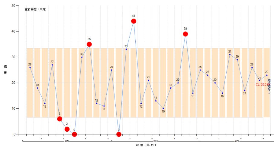
Figure 1 shows that the reporting of adverse events (incident reporting system, IRS) has
worsenedshown by the level dropping below the LCL.

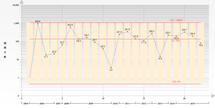
improvementin indicators where the goal is
the lower the better, since the indicator line does not leave the area between UCL and LCL. In these circumstances, statistical procedures must be used to result in a LCL which is clearly above zero, with room to demonstrate that the indicator being monitored drops below LCL, into the region below the LCL and above zero (Figure 2).

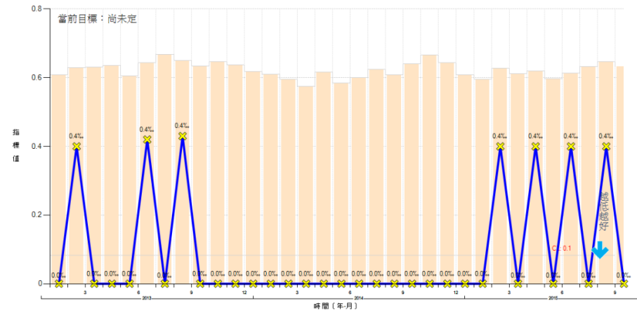
VAP documentation suffers from under-reporting, but does a continuous run of zeros (Figure 3) indicate success, or is it due to random variation or poor data validation?
Number of consecutive zeros required = ceil(3/CL)
Example: 5 VAP over five months (475 ventilator days), of which the last two months had zero infections.
Baseline rate per day = 5/475 = 0.0105
Number of consecutive days without a VAP to be an improvement = ceil(3/0.0105) = 286 days
Note: aproximately 0.05 significance level.

The size of a subgroup is important in meeting these three conditions. To plan data collection so that the problem of too many zeros is avoided: [3]
- If using sampling, increase the sample size so that the event of interest will be collected.
- If already using all available data (not sampling), adjust the collection time period for subgroups
- If the event does not occur every hour, accumulate into daily subgroups
- If the event does not occur every day, use weekly or monthly subgroups
- If the event does not occur every month, use quarterly or annual subgroups (and so on)
- or … the reverse of the above: reduce the time between data collection if the incidence is high (outpatient events, medical records management, invoice preparation etc). Monthly subgroups can be subdivided and collected on a weekly, daily, or even hourly basis as so long as the minimum subgroup sizes calculated in the following section are exceeded.
The minimum subgroup size depends on the center line (CL) of the chart (average value as decimal). For p and np charts, CL is calculated as the symbol p; for u and c charts, the symbol is λ. Use the following calculations to determine the minimum subgroup size for effective rate-based control charts: [2]
- Usually recommended minimum subgroup size = 5 ÷ CL.
[For CL>0.5 (50%) use (1-CL) instead of CL in the above calculations]- For p and np charts,
§ Rule 1: n ≥ 5/[min(p,1-p)]
§ Rule 2: n ≥ ln(0.05)/ln[max(p,1-p)]
…………………………
Example: surgical site infection rate of 9 infections out of every 100 operations (p = 0.09),
§ Rule 1: n ≥ 5/[min(0.09,0.91)] → 5/0.09 → 55.5
§ Rule 2: n ≥ ln(0.05)/ln[max(0.09,0.91)] → ln(0.05)/ln(0.91) → 31.8 - For u and c charts,
§ Rule 1: n ≥ 5/λ
§ Rule 2: n ≥ -ln(0.05)/λ
…………………………
Example: catheter-associated infection rate (λ) of 1.25 infections per every 100 catheter days,
§ Rule 1: n ≥ 5/(1.25/100) → 400 catheter days
§ Rule 2: n ≥ -ln(0.05)/(1.25/100) → 2.996/(1.25/100) → 240 catheter days
- For p and np charts,
- Minimum subgroup size required to have a lower control limit (LCL) greater than zero = 9 ÷ CL
In the following equations, the symbol k is the number of standard deviations used in the control limits (typically 3, or the T-sigma limits).- For p and np charts,
§ Rule 3: n > k2(1-p)/p
…………………………
Example: surgical site infection rate of 9 infections out of every 100 operations (p = 0.09),
n > 32×(1-0.09)/0.09 = 91
Since the rule says [>] and not [≥], the answer is 92. - For u and c charts,
§ Rule 3: n > k2/λ
…………………………
Example: catheter-associated infection rate (λ) of 1.25 infections per every 100 catheter days,
n > 32/(1.25/100) → 720
Since the rule says [>] and not [≥], the answer is 721.
- For p and np charts,
- Minimum subgroup size (n) required so that less than 25% of data points are zero = 1.4 ÷ CL [3]
| CL | Zeros (<25%) | 3/CL* | 5/CL | LCL>0 |
|---|---|---|---|---|
| 0.1% | 1,400 | 3,000 | 5,000 | 9,000 |
| 0.5% | 280 | 600 | 1,000 | 1,800 |
| 1.0% | 140 | 300 | 500 | 900 |
| 1.5% | 93 | 200 | 334 | 600 |
| 2.0% | 70 | 150 | 250 | 450 |
| 10.0% | 14 | 30 | 50 | 90 |
| 20.0% | 7 | 15 | 25 | 45 |
| 50.0% | 2 | 6 | 10 | 18 |
Table Legend:
- Column 1: [CL] centerline (% estimate of average rate)
- Column 2: [Zeros] minimum subgroup size required to have less than 25% of all datapoints equal to zero = 1.4/CL
- Column 3: [3/CL*] minimum subgroup size common guideline (lower recommendation)
The asterisk indicates that this is also the number of consecutive subgroups equal to zero required to show that a change is an improvement and not natural variation in the process. - Column 4: [5/CL] minimum subgroup size common guideline (recommended value)
- Column 5: [LCL>0] minimum subgroup size required to have lower control limit above zero = 9/CL
What is a rare
event? [1]
When the attribute is a relatively rare event, the guidelines above often can not be met. In these cases, the basic Shewhart charts may not be useful to detect improvement. An alternative is to develop control charts for the time between events
(t-chart) or the number of units between events
(g-chart).
- If rate > 0.10 (number-between < 10), use standard percent type of measures; for example:
3 SSI in 20 patients = 0.15 - If rate < 0.01 (number-between > 100), use number-between type of measures; for example:
§ 1 complication in 200 cases = 0.005
§ 1 needle stick in 100 days = 0.01 - If 0.01 < rate < 0.10, use either/both measures
Try It Yourself! Calculate QCC subgroup
References:
-
Benneyan JC.
Measuring Rare Events and Time-Between Measures
www.ihi.org/resources/.../ -
Benneyan JC.
Design, Use, and Performance of Statistical Control Charts for Clinical Process Improvement
pdfs.semanticscholar.org 2001 -
Provost LP, Murray SK.
The health care data guide. Learning from data for improvement
www.amazon.com 2011. John Wiley & Sons.